


Cream vs beige: what's the difference, and which should your room use?
Cream is warm milk in the morning; beige is a latte in the afternoon. They look alike, but they give a room very different moods.
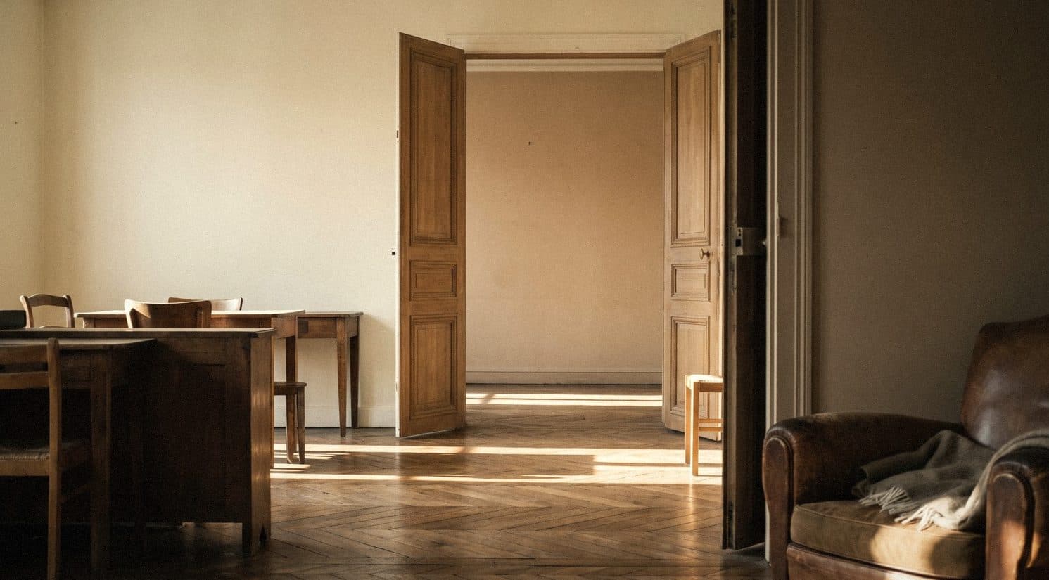
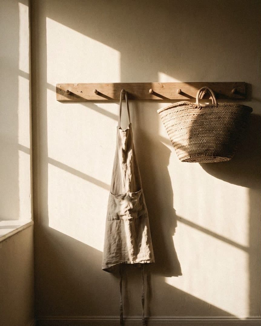
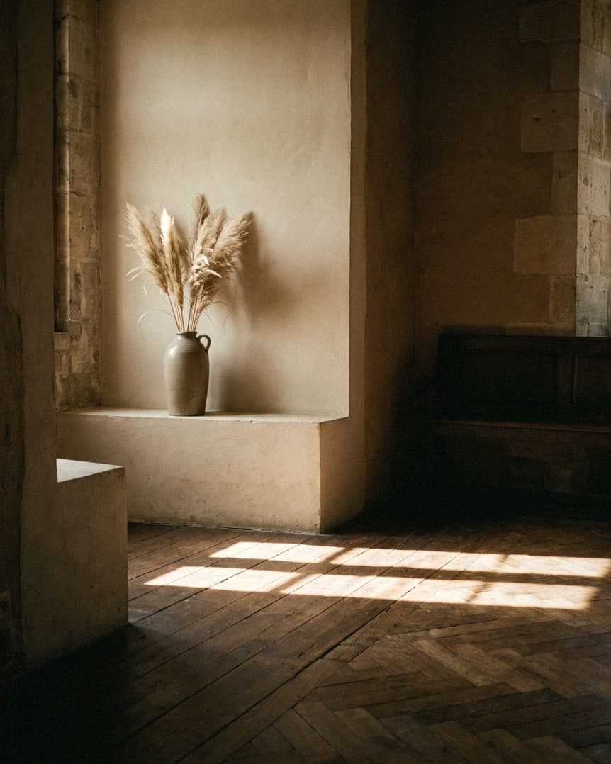
Cream and beige differ in what's mixed into them. Cream is a white with yellow in it, bright and soft, and suits rooms with little light or rooms you want to look bigger. Beige is a white with brown or grey in it, calmer and more expensive-looking, and suits rooms with a lot of sun or where you want a warm minimal look.
Cream vs beige: the difference is in the mix
Cream is white with a little yellow added. Beige is white with brown or grey added. In drinks, cream is warm milk in the morning and beige is a latte in the afternoon. The colours are close, but the mood is completely different.
An easy way to tell is to put a sheet of white paper next to the colour sample. If you can clearly see yellow, it's cream. If you see a faint brown or grey, it's beige.
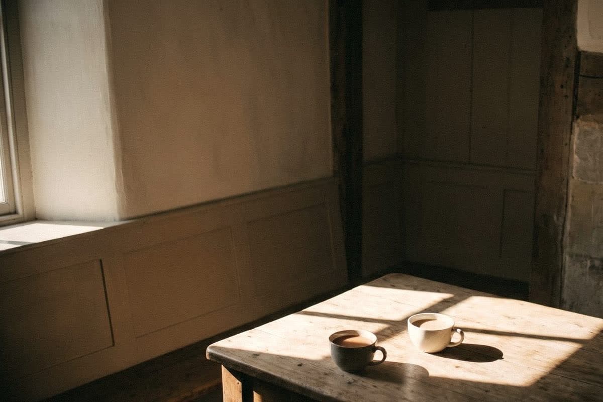
Cream: bright, soft, and makes a room feel bigger
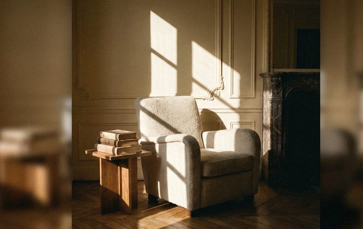
Cream reflects light well, so it suits north-facing condos, rooms with small windows and dark hallways. The room looks bigger and cleaner straight away.
Ivory is a classic cream that isn't so yellow it looks dated. Coconut Ice Cream is soft, like coconut-milk ice cream. Custard Cream is one step more clearly yellow, and suits a kitchen or dining room you want to feel warm from the morning on.
Beige: calm, warm, and expensive-looking
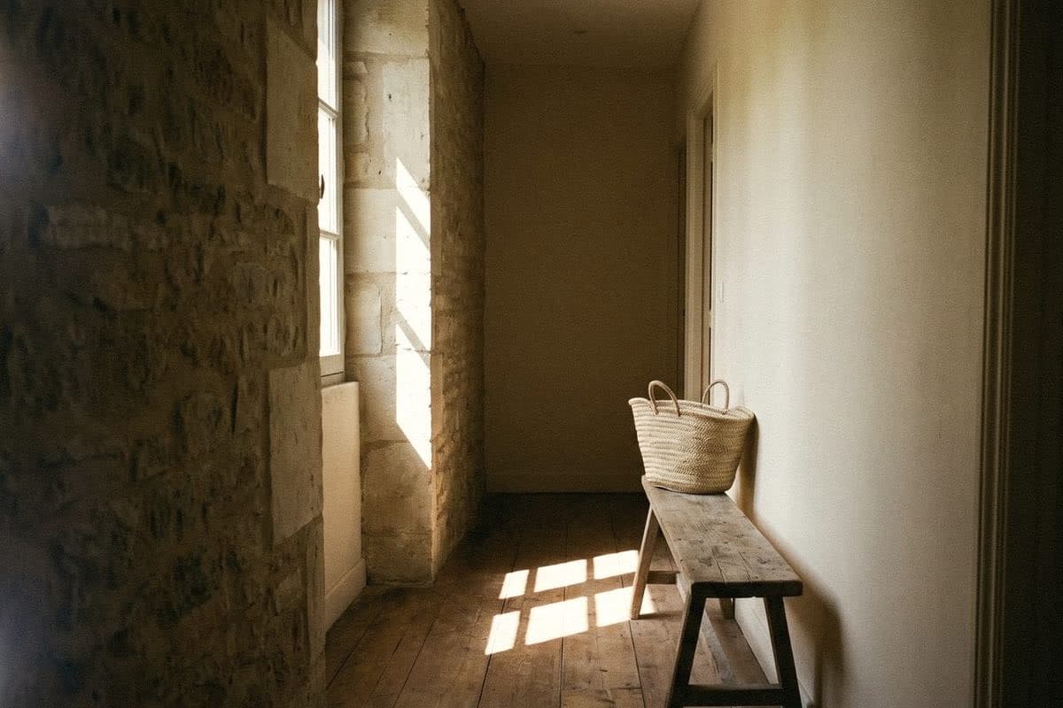
Beige has more weight than cream, so a room looks calmer and more grown-up. Under strong Thai sun, beige isn't as glaring as cream, so it's easier on the eyes in a room that gets the full afternoon sun.
Linen is a beige with a faint brown, like a favourite linen shirt: a little creased, but always looks expensive. Oatmeal is soft, like oat cream. If you want a surface with depth, Chill Beige in Mineral Finish makes a beige wall look like hand-applied plaster in a boutique hotel.

Choosing cream or beige: look at the room and the light
Neither colour wins outright. One simply suits a room better than the other.
- A dim or small room: choose cream, and the room will look bigger.
- A sunny or west-facing room: choose beige to cut the glare.
- Pale wood furniture: cream makes it look fresh, beige makes it look warm.
- Grey or black furniture: beige goes with it more easily.
- For a Japanese minimal look: a beige, or a cream with a little grey in it.

Can you use cream and beige together?
Yes, and it's a very safe pairing. Use beige on one feature wall and cream on the rest, or use cream on the ceiling and cornices to make a beige room feel airier.
Before you paint for real, buy 100ml sample pots of both colours at ฿75 each, paint them side by side on a real wall, then look at them in the morning and with the lights on. Colour on a screen never matches colour on a wall.

“Cream is warm milk in the morning. Beige is a latte in the afternoon.”
Frequently asked questions
What's the difference between cream and beige?
Cream is a white with yellow in it, bright and soft. Beige is a white with brown or grey in it, calmer and warmer.
Should a small room be cream or beige?
Cream suits it better, because it reflects light well and makes the room look bigger.
What colour suits a very sunny room?
A beige like Linen or Oatmeal helps cut the glare and makes the room easy on the eyes.
Can cream and beige be used together?
Yes. Use beige on a feature wall and cream on the remaining walls or the ceiling, and the room will feel unified.

Colour on a screen never matches colour on a wall
Order a sample to paint at home, or come and see the full shade library at Voqe Studio, Bang Phli.
See all cream shadesRead next
Cream: a slightly kinder white for a home that feels soft all day
Cream is white with a kinder heart: warmer than white, brighter than beige. Voqe's cream shades, and how to choose one without turning your room yellow.
Read article
Beige: how to paint your home so it looks expensive without trying
Beige is the linen shirt of house paint: wear it every day and it never dates. Voqe's beige shades, and how to choose one to suit the light in your home.
Read article
White: how to choose one that won't turn yellow, grey or hospital-white on your walls
The white in the shop and the white on your wall are not the same white. A guide to choosing white for Thai sunlight, the way your windows face and the bulbs in your room.
Read article