


Pantone 2026 is Cloud Dancer, the white of the year: how to use it at home without it looking bland
The colour of the year for 2026 isn't a bright one. It's a soft white called Cloud Dancer. Here's how it differs from ordinary white, and how to use it so a room feels bright but not bare like an unsold show unit.
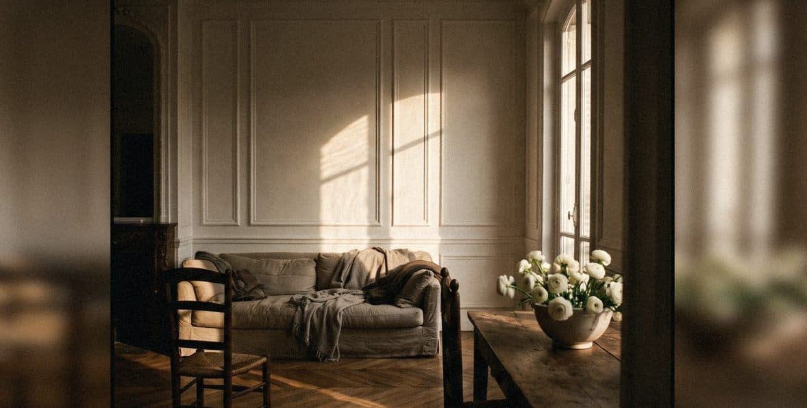
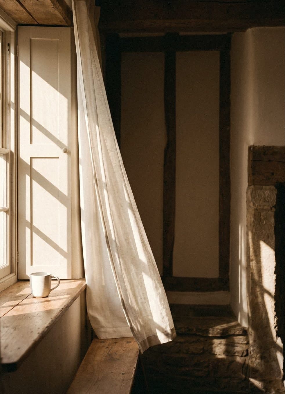
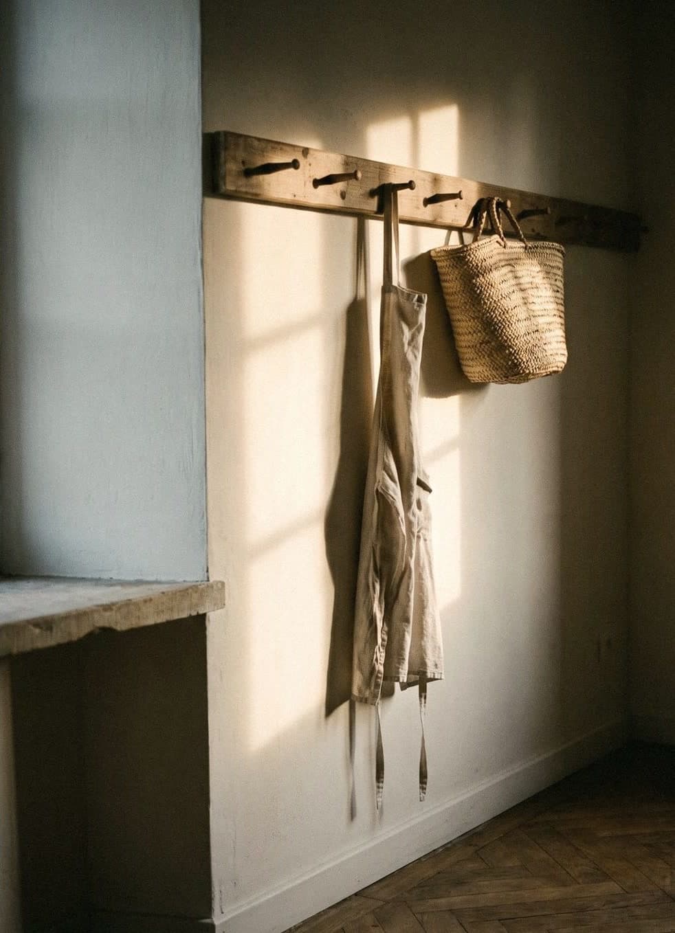
Pantone Color of the Year 2026 is Cloud Dancer (PANTONE 11-4201), a soft, airy, light white rather than the stark white of photocopier paper. At home, Cloud Dancer suits walls and ceilings, making a room bright and open and acting as a backdrop that lets the wood, stone, fabric and other colours in the room stand out.
What is Pantone 2026, and what does Cloud Dancer look like
Every year the Pantone Color Institute chooses one colour as its Color of the Year, to reflect the mood of the moment. That colour then turns up in fashion, graphics, everyday objects and home decoration all year. For 2026, the colour chosen is Cloud Dancer, code PANTONE 11-4201.
Cloud Dancer is a soft, airy white. It isn't the glaring white of an operating theatre light, but a white with a slight softness to it, like thin clouds in the morning. It's easy on the eye and never harsh.
The year before, Pantone chose Mocha Mousse (PANTONE 17-1230), a soft, warm brown. The move from brown to white is interesting, because both are colours that sit easily in a home. Neither needs much courage to use.
- Name: Cloud Dancer
- Code: PANTONE 11-4201
- Character: a soft, airy, light white
- Previous colour of the year (2025): Mocha Mousse, PANTONE 17-1230

Why is the colour of the year white?
White doesn't mean nothing. In design, white is the space that lets everything else breathe, like a white plate that makes food look more appetising, or a page with just the right margins that makes it comfortable to read.
You could read Cloud Dancer as the colour of rest, of starting again, and of turning down the noise in life. In a real home that translates very simply: a room that doesn't have to shout, but lets the things you chose with care take the lead.

Using Cloud Dancer at home: which rooms suit it
A soft white like this works in almost every room, but it shines most in rooms with natural materials or a fair amount of natural light, because its softness takes the light and looks warmer, never hard like a stark white.
- Ceilings: a soft white makes the ceiling feel higher without contrasting too sharply with the walls
- Living room: a backdrop for a fabric sofa, wood and artwork
- Bedroom: the clean feel of hotel sheets, without being cold
- Kitchen and dining room: goes with stone counters, wood and ceramics
- Condos and small rooms: blurs the edges of the room so it feels larger

Pairing Cloud Dancer with wood, stone and other colours
The good thing about a soft white is that it goes with almost anything. But if you want the room to look intentional, think of it as a good white T-shirt: it goes with everything, but with the right trousers it looks many times better.
- Light woods such as oak or ash: a Scandinavian or Japandi look
- Dark woods such as walnut or teak: a warm mid-century feel
- Cream stone or travertine: quiet, resort-style luxury
- Linen, cotton and rattan: add texture so the room doesn't look flat
- Thin black steel: adds sharp lines for a modern look
- Accent colours such as sage green, indigo blue or mocha brown: use them on cushions, artwork or one feature wall

Choosing a white wall paint close to Cloud Dancer
Pantone codes are a colour reference system for design, not house paint formulas, so no wall paint can claim to be an exact match. What you can do is find a white with a similar mood: a white that isn't glaring and isn't so yellow it becomes cream.
The light in our homes makes a big difference. Thai sun is strong, and a blue-tinged white in a room with harsh sun can look hard. In a room with little light or one facing north, a white with a touch of warmth stops the room looking dull. The best approach is to put a real paint sample on the wall and look at it in the morning, in the afternoon, and with the lights on at night.
If you want to compare several shades before deciding, Voqe has sample bottles in several whites to try, such as Snowflake, Powder Snow, Pearl White and Ivory. If you'd like a white with texture, try Yogurt or Seashell in Mineral Finish.

Common mistakes when painting the whole house white
White looks easy, but it's easier to get wrong than you'd think, because the small differences between whites become very obvious on a large wall.
- Choosing from a phone screen: the colour on screen never matches the colour on the wall
- Mixing different whites at random between walls, ceilings and cornices until it looks like the paint has gone off
- Painting the whole room white with no other texture at all: the room will look like an unsold show unit
- Forgetting the light bulbs: very cool white bulbs turn a soft white into a cold white
- Not checking the undertones of the floor and furniture you already have
“A good white isn't empty. It just leaves room for your life.”
Frequently asked questions
What is the Pantone colour for 2026?
Pantone Color of the Year 2026 is Cloud Dancer, code PANTONE 11-4201, a soft, airy, light white that isn't stark.
How is Cloud Dancer different from ordinary white?
Cloud Dancer is a softer, gentler white than a bright, stark white and is easy on the eye, so it suits being the background colour of a home better than a white that feels cold and hard.
Is there a house paint that matches Cloud Dancer?
Pantone codes aren't house paint formulas, so no wall paint is an exact match. Choose a white with a similar mood, then try a real sample on the wall in the room's light before you decide.
Is it a good idea to paint the whole house white?
Yes, if you choose a white that suits the light in your home and add texture from wood, fabric or one feature wall. White throughout with no other materials can make a home look flat and too cold.
What was the Pantone colour for 2025?
Pantone Color of the Year 2025 was Mocha Mousse, code PANTONE 17-1230, a soft, warm brown that pairs well with Cloud Dancer at home.

Colour on a screen never matches colour on a wall
Order a sample to paint at home, or come and see the full shade library at Voqe Studio, Bang Phli.
Order white sample bottles to compareRead next
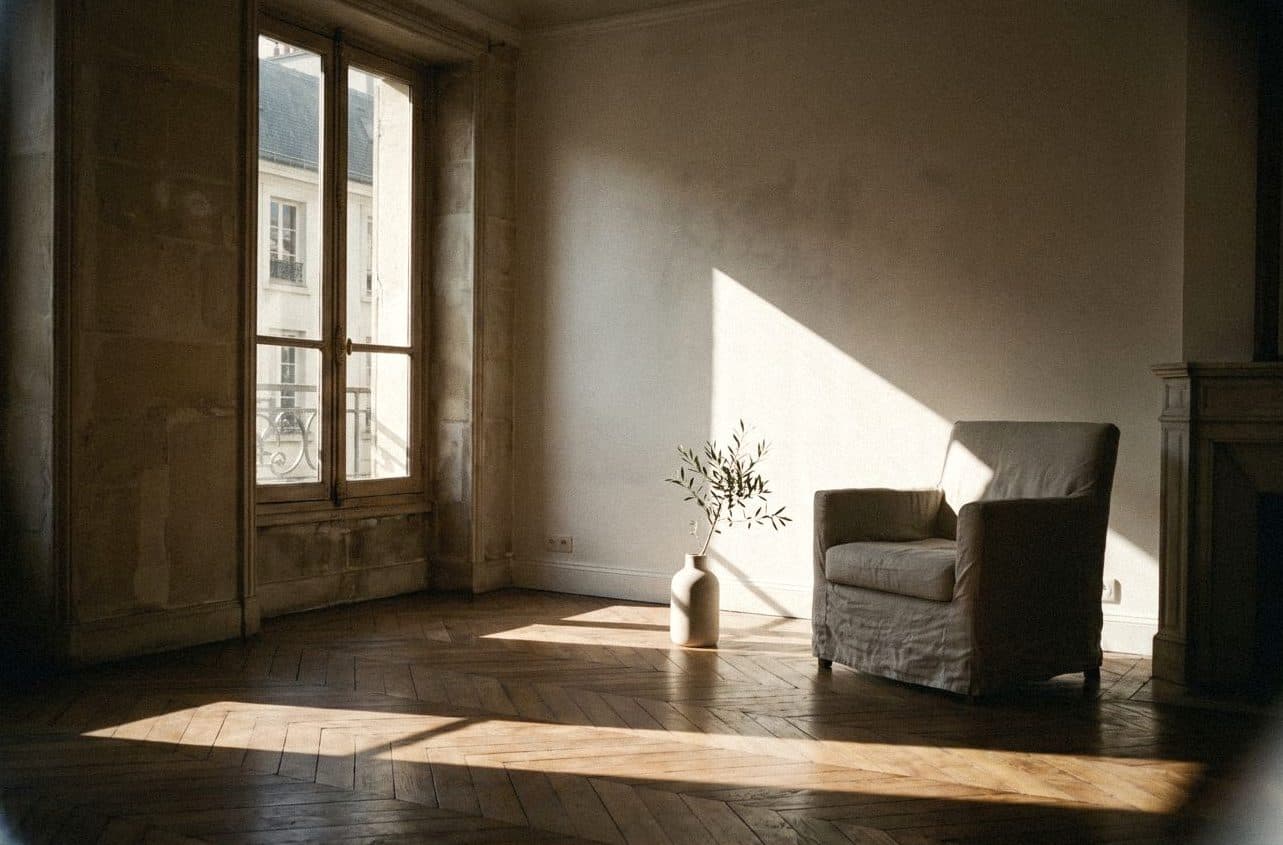
White: how to choose one that won't turn yellow, grey or hospital-white on your walls
The white in the shop and the white on your wall are not the same white. A guide to choosing white for Thai sunlight, the way your windows face and the bulbs in your room.
Read article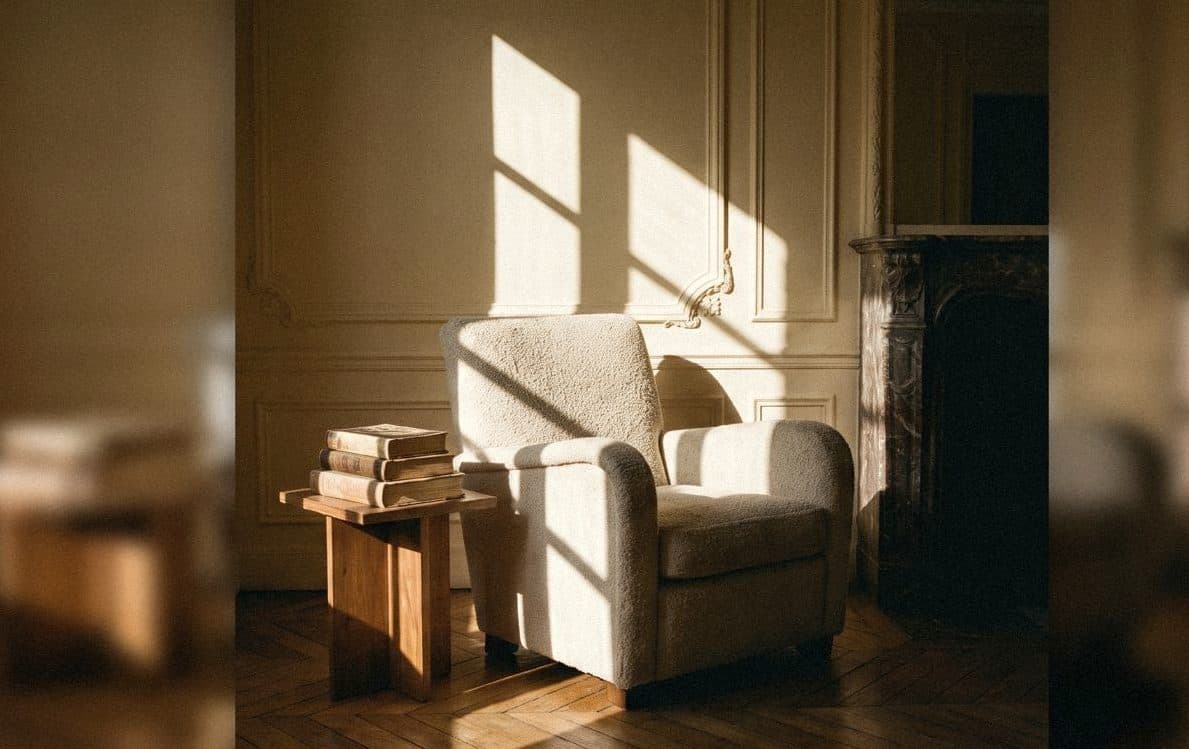
Cream: a slightly kinder white for a home that feels soft all day
Cream is white with a kinder heart: warmer than white, brighter than beige. Voqe's cream shades, and how to choose one without turning your room yellow.
Read article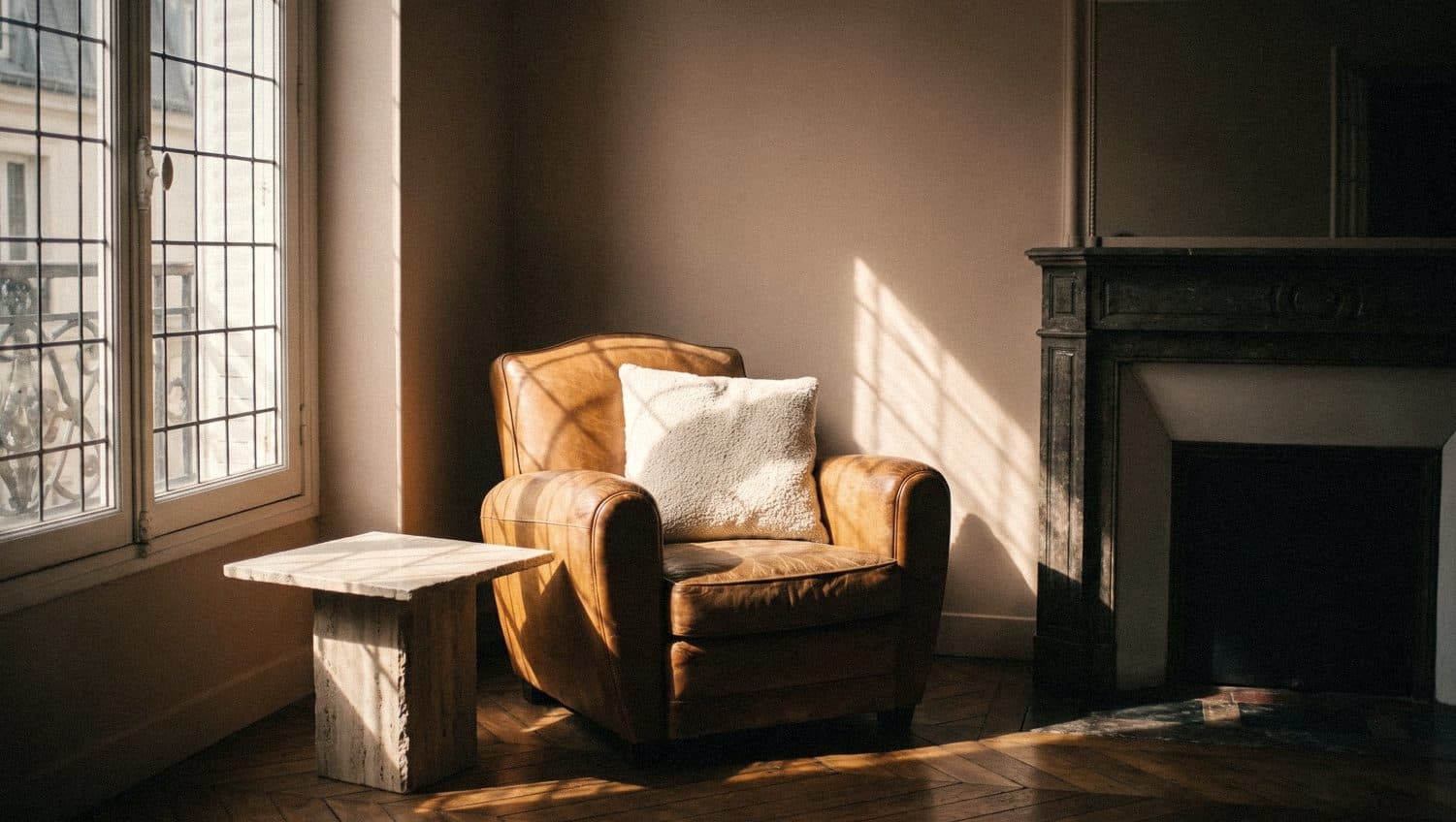
Mocha Mousse at home: the soft brown that's still on trend
The milky mocha brown that was colour of the year for 2025 can stay in your home for a long time yet. Here's which rooms suit it, what to pair it with, and how to use it without making a room dark.
Read article