


What colour should you paint the inside of your house? Plan colours that flow through the whole home, with 10 palettes that really work
A beautiful home doesn't have lots of colours. Start with one main colour that flows through the house, then adjust room by room to suit the light.

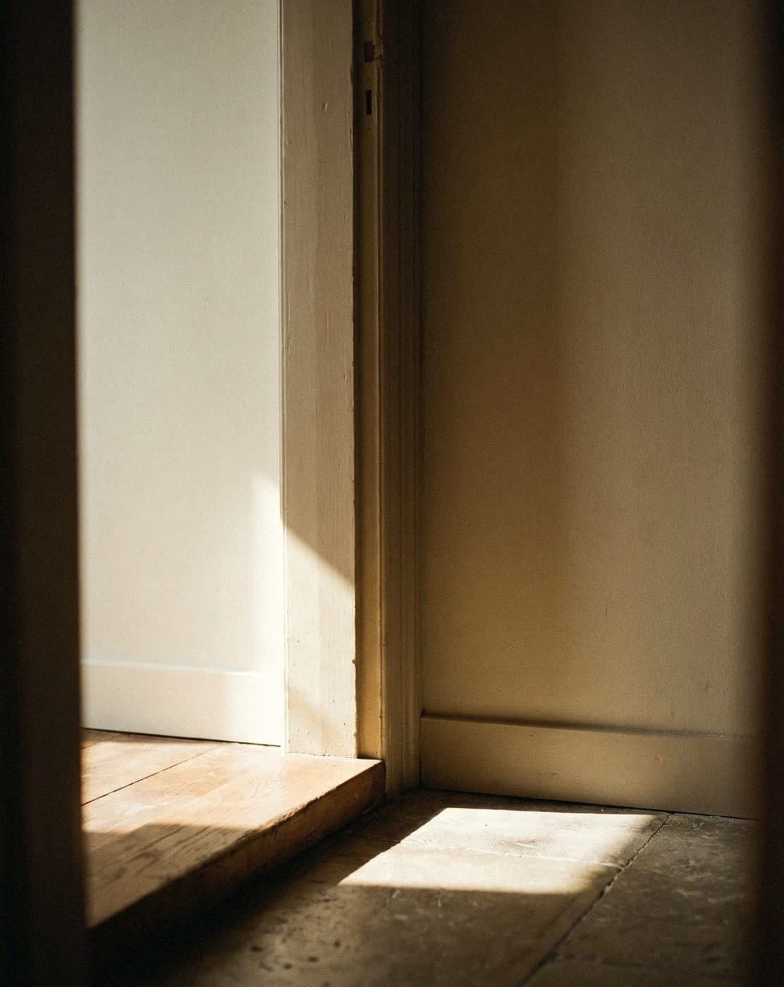
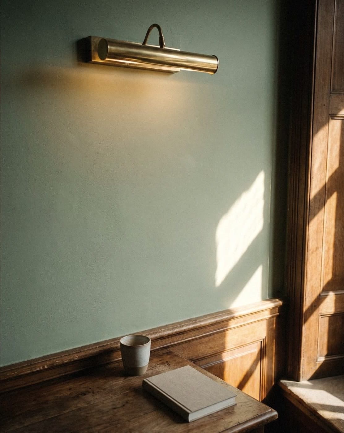
The approach that works best for choosing interior paint colours is to pick one neutral, warm main colour, such as warm white, cream or pale beige, and let it flow through all the shared spaces of the house. Then give the other rooms lighter or deeper shades in the same tone, according to the direction of the light and how each room is used. This makes the house feel bigger and more connected, and the colours never clash.
Interior colour starts with one main colour
Most homes that look expensive don't have lots of colours; they have colours that get along. It's like the wardrobe of someone who dresses well: a few basics in colours that go with anything, then statement pieces added one at a time.
The main colour is the one you paint through the connected spaces: the entrance hall, corridors, stairs, the living room and anywhere you can see from one to the other. It should be neutral, slightly warm, and able to live with wood, stone and many kinds of fabric. Warm white, pale cream, beige, linen or warm grey are safe choices, because they look good both by day and under the lights at night.
Choose the main colour from the things that are hard to change before the things that are easy to change. Look at the floor, the wooden stairs, the doors and the big sofa first, then find a wall colour that goes with them. Don't start from the cushions.
- Orange or red-toned wooden floors: warm white, cream, linen
- Grey tiles or polished concrete floors: warm grey, grey-white, greige
- Light wooden floors: soft white, pale cream, pale sage green
- White marble floors: clean white, or a slightly warm white

Adjusting colour room by room without the house clashing
Once you have a main colour, the rooms with doors you can close are where you can play more with colour: bedrooms, the study, bathrooms, children's rooms. But keep them in the same family as the main colour. If the main colour is cream, for example, the bedroom might be a beige one step deeper, and the study a sage green with the same kind of warmth.
The 60-30-10 rule helps a lot. 60 is the walls and large surfaces, 30 is the furniture, fabrics and floor, and 10 is the accent colour, which could be a headboard wall, a single door or the decor. One accent colour per room is enough.
- Hall, corridors, living room: the main colour
- Bedroom: the main colour one step deeper, or a soft cool tone if the room is hot
- Study: a muted green or blue that rests the eyes
- Kitchen: light, easy-to-wipe walls, with the accent colour on the cabinets or tiles
- Bathroom: you can go darker or brighter here, because you don't stay long
- Children's room: a light colour as the base, with bright colours in the toys and fabrics

In a Thai home, the direction of the light turns one colour into two
The same colour painted in two rooms can look like two different colours, because the light coming into each room is different. Homes in Thailand sit under a sun that is towards the south for most of the year. So south-facing rooms are strongly lit for most of the day, north-facing rooms get soft, even light, and west-facing rooms get hot, orange afternoon sun.
The simple principle is to use colour to balance the light. In very warm light, use a slightly cooler colour; in soft, cool light, use a warmer one. And don't forget the bulbs: warm white bulbs make colours warmer, daylight bulbs make them cooler and paler. For rooms used mainly at night, judge the colour under the room's actual bulbs.
- North-facing, soft, steady light: cream, beige and warm colours keep the room from looking gloomy
- South-facing, bright all day: almost any colour works, and dark colours still look alive
- East-facing, morning sun: warm white, pale blue and pale green look fresh
- West-facing, hot afternoon sun: green-greys, muted blues and soft cool tones help it feel cooler

Choose the sheen for the room, not on a whim
Sheen changes the mood of a colour almost as much as the colour itself. Matt or eggshell finishes look soft and hide uneven walls well, which suits living rooms and bedrooms. Semi-gloss reflects more light and is easier to wipe clean, which suits places that get touched, splashed or marked often.
The thing to know is that the shinier the paint, the more it shows every flaw in the wall. On an old, unevenly rendered wall, gloss paint shows up as waves when light hits it at an angle, like a silk shirt that shows every crease.
- Living rooms and bedrooms: matt or eggshell
- Kitchens, bathrooms and corridors that get touched a lot: semi-gloss
- Doors, frames and mouldings: semi-gloss, easy to wipe
- Ceilings: matt, to cut glare from the lights

Test colour samples properly before you buy a whole tin
Colour on a screen never matches colour on a wall, and colour on a small chart doesn't match a whole wall either. What works is to paint your sample in two coats on a large sheet of card, at least A3 size, then move it around several walls in the room, both walls in direct light and walls in shade.
Look at three times of day: morning, afternoon and at night under the lights. If you're torn between two colours, put them side by side on the same wall and your eye will see the difference at once. Voqe has 100 ml sample pots in every shade at ฿75 each. Trying three colours is still many times cheaper than painting one room the wrong colour.
- Paint on card A3 size or bigger, in two coats
- Put it on a wall that gets the light and a wall in shade
- Look in the morning, the afternoon and at night under the actual bulbs
- Hold it against the floor, doors and curtains
- Leave it two or three days before deciding

10 beautiful interior palettes that work through the whole house
Each set runs in this order: a main colour for the shared spaces, a secondary colour for bedrooms or rooms you can close off, and an accent colour for a single wall or a door. Use them as a starting point, then adjust to the real light in your home.
- Warm classic: Ivory + Linen + Coffee Bean
- Japanese minimal: Pearl White + Oatmeal + Tea Leaf
- Easy warm grey: Soft Gray + Marble + Volcanic Rock
- Saturday afternoon by the sea: Snowflake + Mist + Navy
- City garden: Coconut Ice Cream + Milk Green Tea + Pine Green
- Earth tones: Sand Dust + Coconut Sugar + Antique Brick
- Bright whites for a condo: Blizzard + Powder Snow + Cigarette Smoke
- Sweet, soft creams: Yogurt White + Pink Milk + Old Rose
- Café at home: Oatmeal + Caramel + Chocolate
- Deep and rich, but not dark: Pearl White + Smoke + Twilight Green
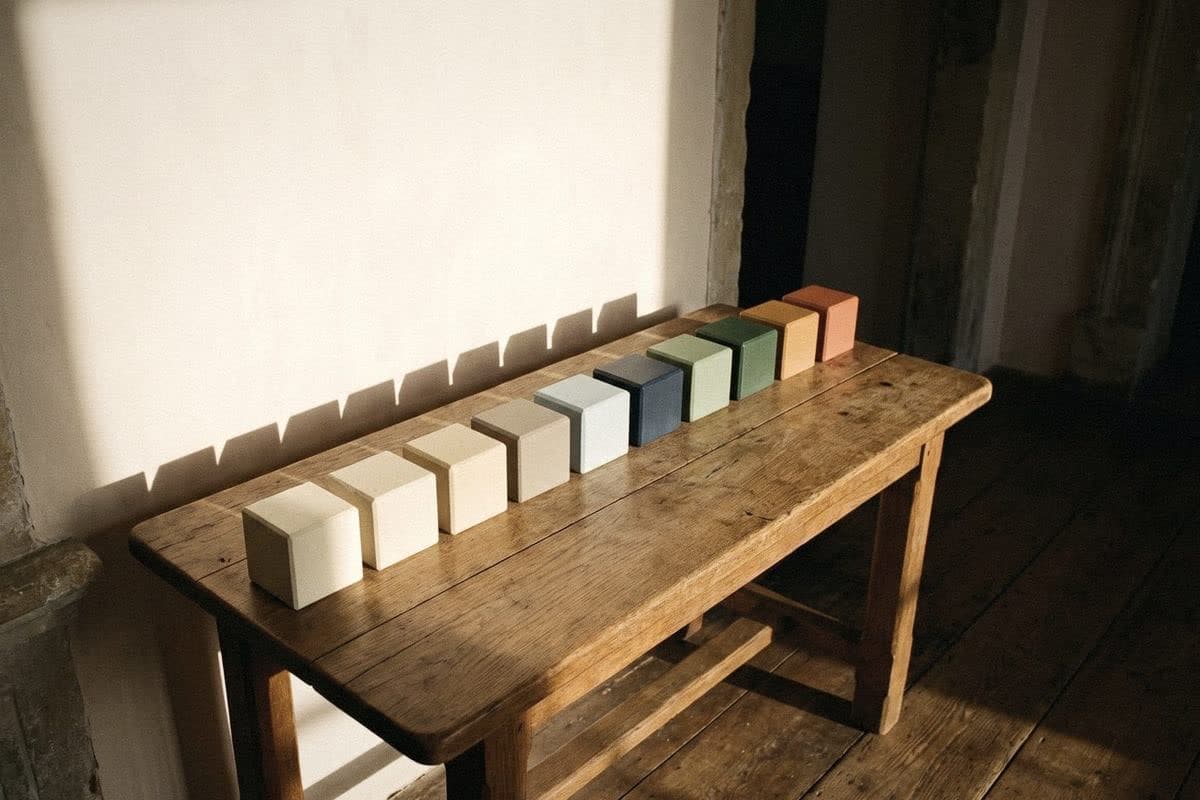
“A beautiful home doesn't have lots of colours. It has colours that get along.”
Frequently asked questions
What colour should I paint the inside of my house?
Start with a neutral, warm main colour, such as warm white, cream or pale beige, in all the shared spaces of the house. Then give the other rooms lighter or deeper shades in the same tone, according to the direction of the light and how each room is used.
How many colours should I use inside my home?
Three to five colours for the whole house is enough: one main colour, one or two secondary colours, and one or two accent colours. Within a single room, you can use the 60-30-10 rule.
Should I use matt or semi-gloss paint indoors?
Living rooms and bedrooms usually take matt or eggshell, because it is soft on the eye and hides uneven walls. Kitchens, bathrooms, doors and mouldings take semi-gloss, because it is easier to wipe clean.
Roughly how much does it cost to paint a home's interior?
It depends on the size of the house, the number of coats and the type of paint. Work it out as wall area times the number of coats, divided by the coverage, which for a typical acrylic paint is about 30–40 sq m per gallon per coat. Add 10%, then compare prices per tin.
Which interior colours make a home look bigger?
Light colours that reflect light well, such as warm white, pale cream and light grey, with a white ceiling, help a home look bigger. Painting one colour continuously through connected spaces also makes the house feel more open than changing colour in every room.

Colour on a screen never matches colour on a wall
Order a sample to paint at home, or come and see the full shade library at Voqe Studio, Bang Phli.
Take the quiz to find your home's main colourRead next
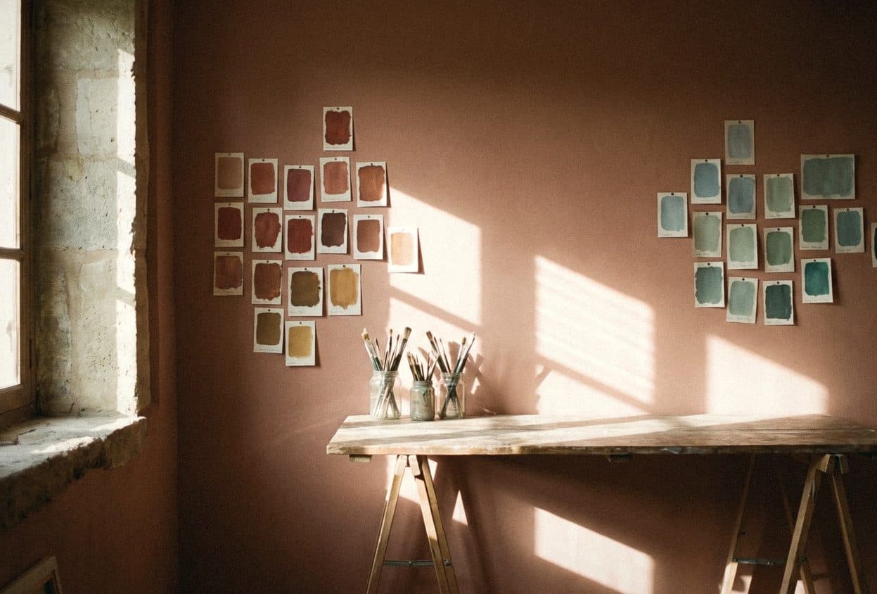
How to pair colours at home: the colour wheel, warm and cool tones, and the 60-30-10 rule
You don't need art school to put together beautiful colours at home. Just understand the colour wheel, warm and cool tones, the 60-30-10 rule, and the light in your own room.
Read article
White: how to choose one that won't turn yellow, grey or hospital-white on your walls
The white in the shop and the white on your wall are not the same white. A guide to choosing white for Thai sunlight, the way your windows face and the bulbs in your room.
Read article
Light interior paint colours that make small rooms look bigger and condos instantly airier
A small room doesn't always need less furniture. Sometimes it just needs walls that are better at passing the light along.
Read article