


How to pair colours at home: the colour wheel, warm and cool tones, and the 60-30-10 rule
You don't need art school to put together beautiful colours at home. Just understand the colour wheel, warm and cool tones, the 60-30-10 rule, and the light in your own room.
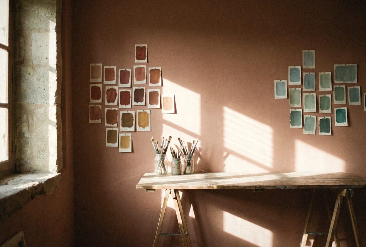
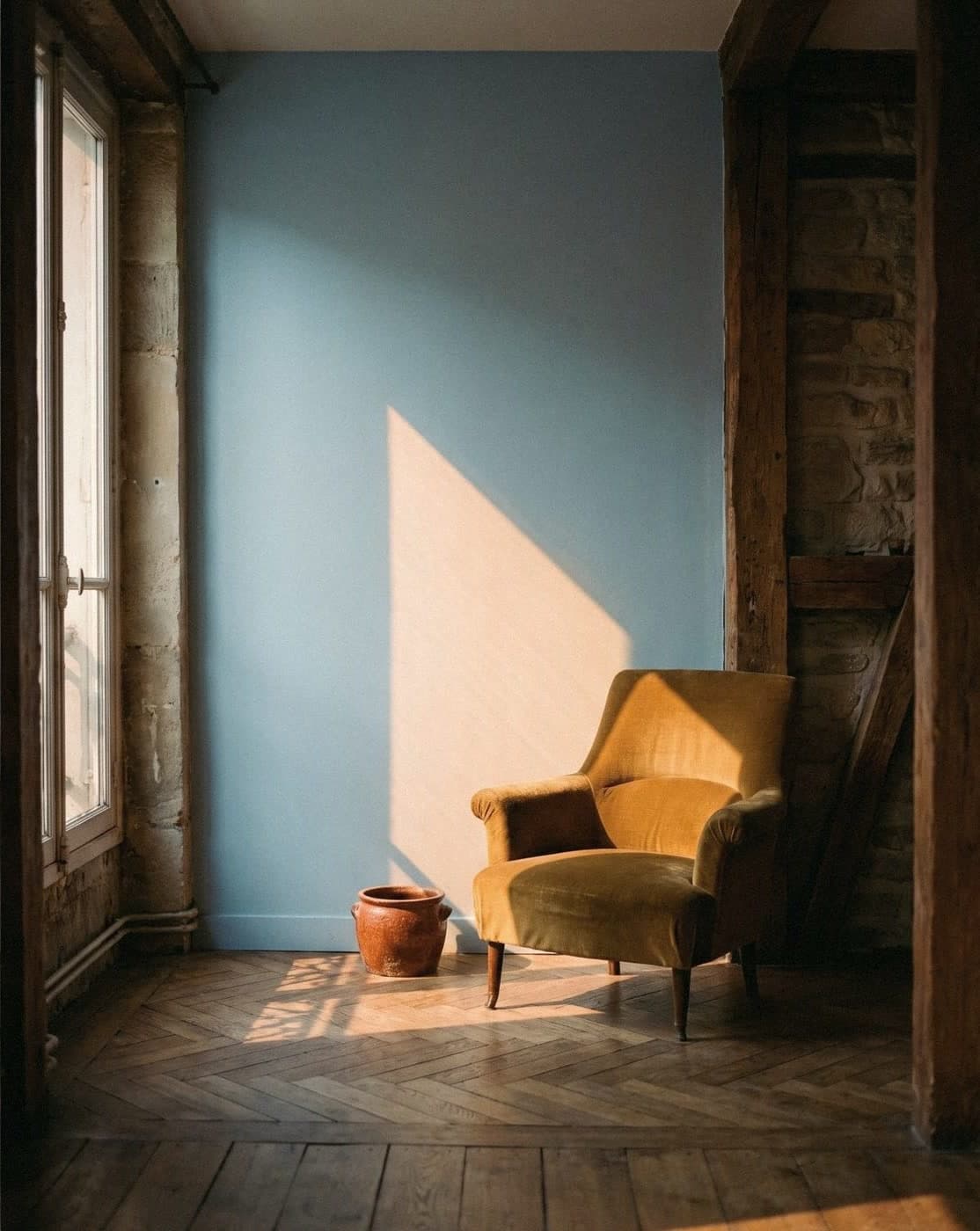
There are three colour rules for the home that really work. Choose pairings from the colour wheel: neighbouring colours give harmony and opposite colours give contrast. Divide the room by the 60-30-10 rule: 60% main colour, 30% secondary colour and 10% accent. Then check the undertones and the direction of the room's light every time before you decide.
What the colour wheel is, and how to read it for your home
The colour wheel arranges colours in a circle according to how they relate to each other. The usual wheel has 12 colours, starting from three primaries, which mix into secondary and tertiary colours. Colours next to each other on the wheel go together easily; colours opposite each other contrast sharply.
At home we hardly ever use the bright colours of the wheel as they are. We use versions mixed with white, grey or black, such as a muted blue instead of a bright blue, or sage instead of leaf green. The relationships on the wheel still work the same way; they're just less intense.
- Primary colours: red, yellow, blue
- Secondary colours: orange, green, purple (each made by mixing two primaries)
- Tertiary colours: for example red-orange, yellow-green, blue-purple
- A tint is a colour mixed with white, a shade is a colour mixed with black, and a tone is a colour mixed with grey

Warm and cool colours: what's the difference
Split the colour wheel in half. The red, orange and yellow side is warm; the green, blue and purple side is cool. Warm colours feel cosy and energetic and seem to bring the walls closer. Cool colours feel calm and relaxed and seem to push the walls further away.
In Thai homes, which are hot almost all year, many people like cool colours in rooms that get strong sun, because they make the room look cooler, even though the actual temperature doesn't change. In rooms you want to feel warm, such as the dining room or a corner for sitting in the evening, muted warm colours help a lot.
- Warm: red, orange, yellow, coral pink, brown
- Cool: green, light blue, blue, purple, blue-grey
- Neutrals: white, grey, beige, which lean warm or cool depending on their undertone

Colour schemes for the home: analogous, complementary and monochromatic
Designers have long-standing formulas for combining colours. None of them is right or wrong; choose by the mood you want. If you want a calm room, use a scheme where the colours sit close together. If you want a room with energy, use one where they sit far apart.
- Monochromatic: one colour at several depths, such as light beige, mid beige and brown; the easiest way to look calm and luxurious
- Analogous: three neighbouring colours on the wheel, such as green, blue-green and blue; harmonious and natural
- Complementary: such as blue with orange, or green with pinkish red; lively, and best with one colour as the main and the other as the accent
- Split complementary: one colour with the two colours either side of its opposite; softer than a straight complementary pair
- Triadic: three colours evenly spaced around the wheel; fun, but tone down the brightness when you use it at home
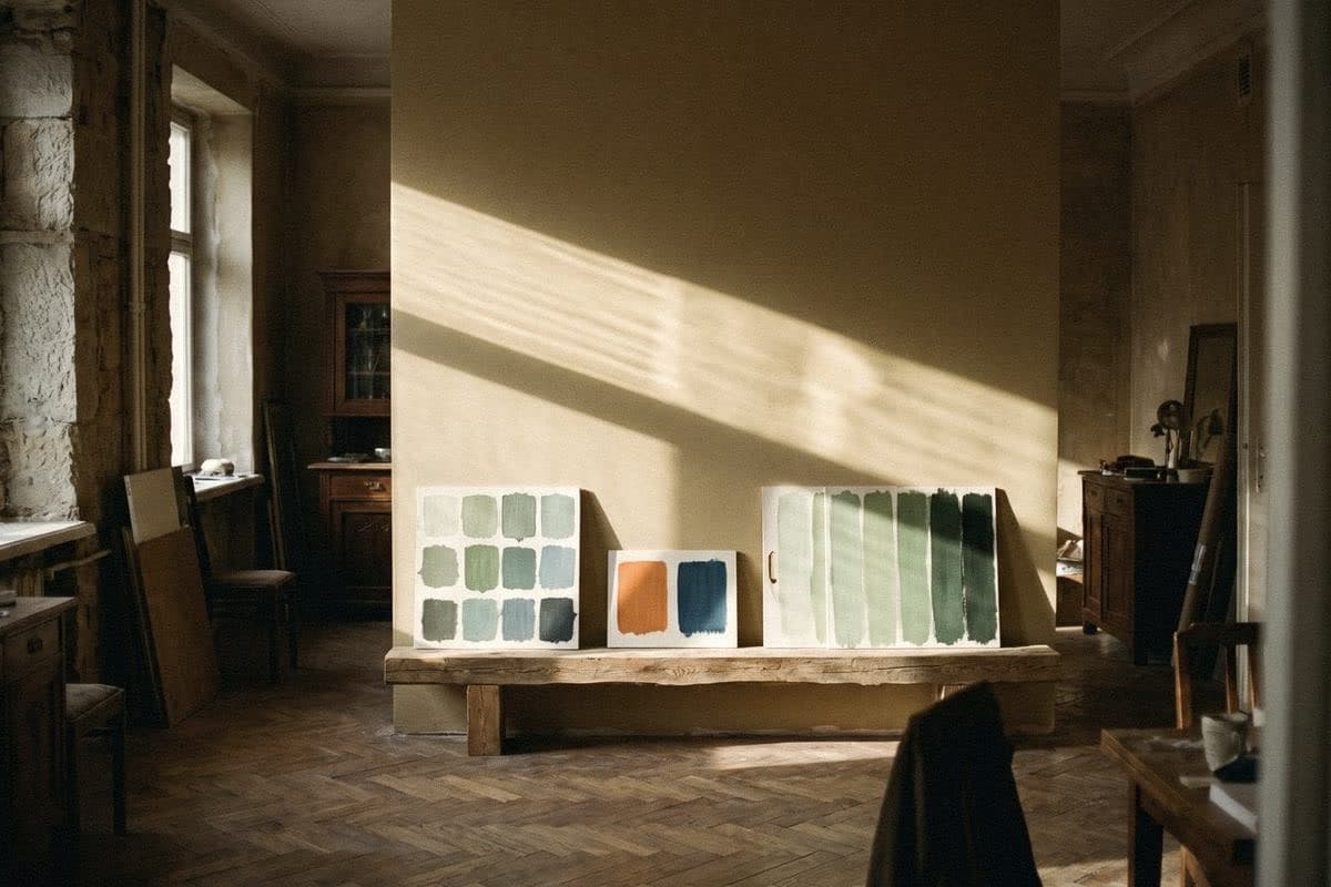
What the 60-30-10 rule is, and how to use it in a real room
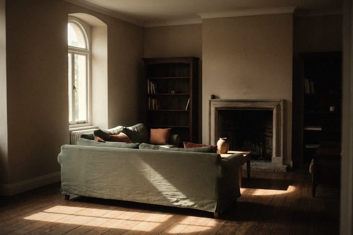
The 60-30-10 rule is a proportion that makes a room look balanced. The main colour, 60%, is usually the walls and large surfaces. The secondary colour, 30%, is large furniture, curtains or a feature wall. The accent colour, 10%, is cushions, artwork or small objects.
Think of a plate of food: 60 rice, 30 curry, 10 dipping sauce. If there's as much sauce as rice, you couldn't eat it. Colour in a room is the same. A good accent colour should be small but clear.
This rule is a starting point, not a law. A minimal room might use 70-25-5; a room where you want to be bolder might push the secondary colour up. What matters is that one colour clearly owns the room.
- Bedroom example: beige walls 60%, sage green bedding and headboard 30%, brick-brown lamp and cushions 10%
- Living room example: soft white walls 60%, warm grey sofa and rug 30%, blue artwork and vase 10%
Undertones: the reason two colours don't go together
The undertone is the colour hidden beneath the main colour. A grey may lean blue, green or purple. A beige may lean pink, yellow or green. Put a blue-grey with a pink-beige, even when the names sound like they match, and the room looks strange in a way you can't quite put your finger on.
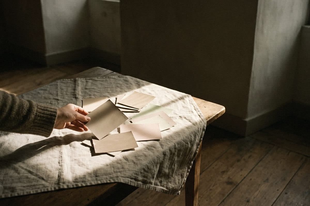
An easy way to see it is to put the paint sample on plain white paper, then compare it with several similar shades. The undertone shows up much more clearly when there's something to compare it with. And don't forget to compare it with the floor, the wood and the furniture you already have, because they have undertones too.
The direction of light in a Thai home changes the colour on the wall
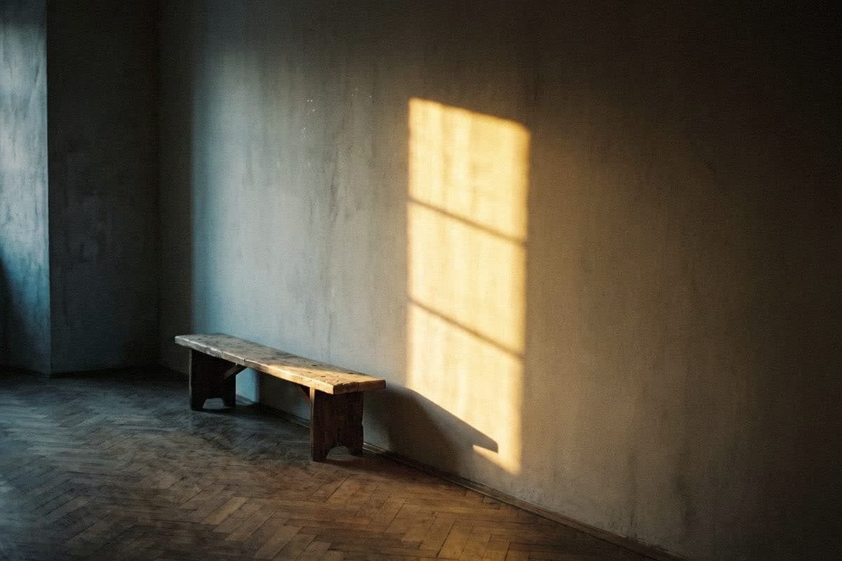
The same colour in two rooms can look like two different colours, because the light is different. Thailand is close to the equator, and the sun is strong and intense almost all year, so the direction your windows face makes a big difference to colour.
The best approach is to paint a large sample on the real wall and look at it through the day. If you don't know which shade to start with, try Voqe's colour quiz to find the tones that suit your room first.
- North-facing: soft, even light that is rather cool; warm colours keep the room from looking dull
- South-facing: lots of light almost all year, so colours look brighter; muted or dark colours work comfortably
- East-facing: bright morning light; the room cools down in the afternoon
- West-facing: hot, orange afternoon sun; warm colours look very warm, so cool tones help balance it
“Colour in a room is like a plate of food: plenty of rice, just enough curry, and a little sauce that has to be good.”
Frequently asked questions
How many colours are on the colour wheel?
The usual colour wheel has 12 colours: three primaries (red, yellow, blue), three secondaries (orange, green, purple) and six tertiaries.
Which colours are warm and which are cool?
Warm colours are red, orange, yellow and colours leaning towards them. Cool colours are green, light blue, blue and purple. White, grey and beige are neutrals that lean warm or cool depending on their undertone.
What is the 60-30-10 rule?
It's a proportion for using colour in a room: 60% main colour, such as the walls; 30% secondary colour, such as furniture and fabrics; and 10% accent colour, such as cushions or artwork. It helps a room look balanced.
What colour should I paint a hot room?
Rooms that get strong sun, especially west-facing ones, usually suit cool colours or cool-leaning neutrals, because they make the room look cooler, even though paint doesn't actually lower the temperature.
Can I use complementary colours at home?
Yes, but tone down their brightness and make one the main colour and the other an accent of no more than about 10%, such as a muted blue wall with brick-orange cushions.

Colour on a screen never matches colour on a wall
Order a sample to paint at home, or come and see the full shade library at Voqe Studio, Bang Phli.
Take the quiz to find the right colourRead next

What colours go with beige and grey? A wall-pairing guide you can't get wrong
Beige and grey are the plain T-shirts of the wall world: they go with anything. But some pairings make a room look more expensive straight away.
Read article
Pantone 2026 is Cloud Dancer, the white of the year: how to use it at home without it looking bland
The colour of the year for 2026 isn't a bright one. It's a soft white called Cloud Dancer. Here's how it differs from ordinary white, and how to use it so a room feels bright but not bare like an unsold show unit.
Read article
Mocha Mousse at home: the soft brown that's still on trend
The milky mocha brown that was colour of the year for 2025 can stay in your home for a long time yet. Here's which rooms suit it, what to pair it with, and how to use it without making a room dark.
Read article