


Two-tone cream exterior paint: combinations that are warm, bright and not yellow
Cream is a kinder white. It doesn't glare in the sun and it doesn't show dust as fast. You just have to choose it carefully, or the house ends up the colour of an omelette.
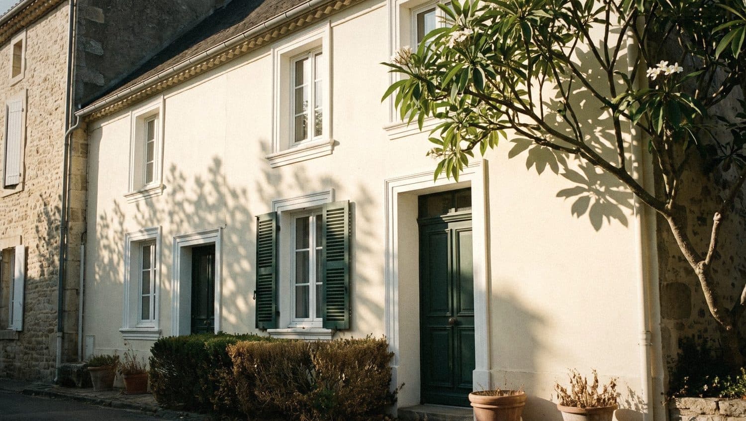
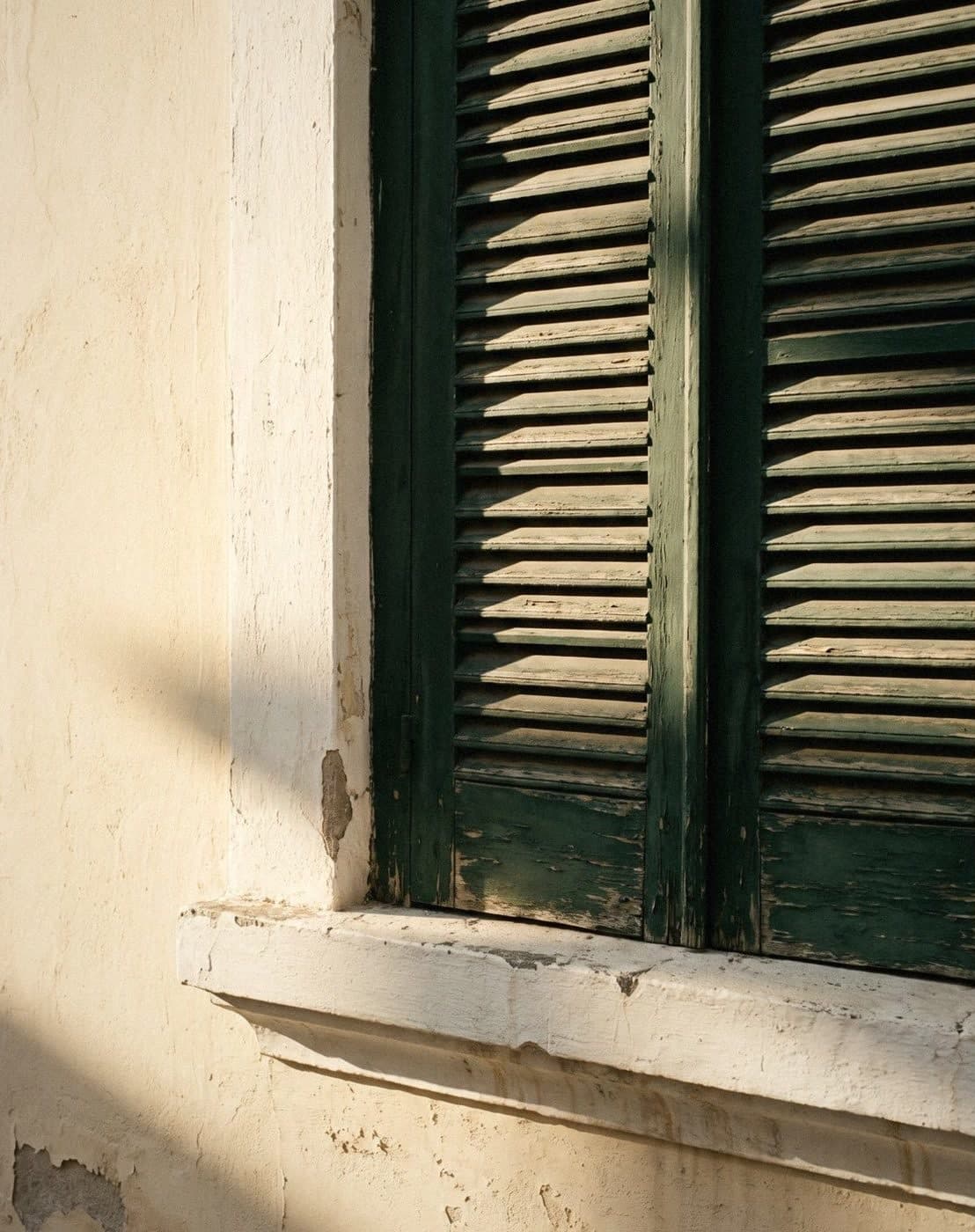
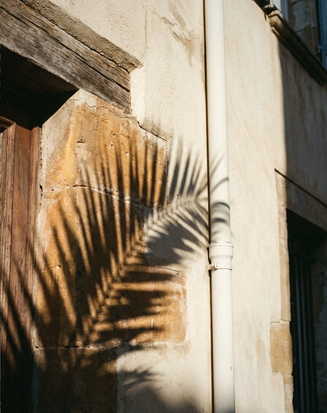
A two-tone cream exterior uses cream for the main walls, with white, grey, brown or green for the trim, bands and door. Cream suits the Thai sun because it's bright but doesn't reflect as much glare as pure white, and it looks warm next to greenery. Choose a cream lighter and more muted than you think, because cream on a large wall always looks yellower and brighter.
Why cream suits a house in Thai light
The Thai sun is strong and white for most of the day, so a bright all-white house reflects light straight into your eyes until you have to squint. Cream takes the glare down a little but stays bright enough for the house to feel airy, and as a light colour it doesn't hold heat the way dark colours do. It's the happy middle, like a bowl of khao tom (rice porridge) at just the right warmth, not so hot it scalds your mouth.
Cream also gets along with everything around the house: trees, tiled roofs, wood and natural stone. Light dust doesn't show as much as it does on a white wall, and when the evening sun hits it, cream glows a soft gold that makes the house look warm as you get home.
- A light colour, so it reflects heat better than dark colours
- Less glare than bright pure white in strong sun
- Hides light dust better than white
- Goes with almost every kind of wood, brick, stone and greenery
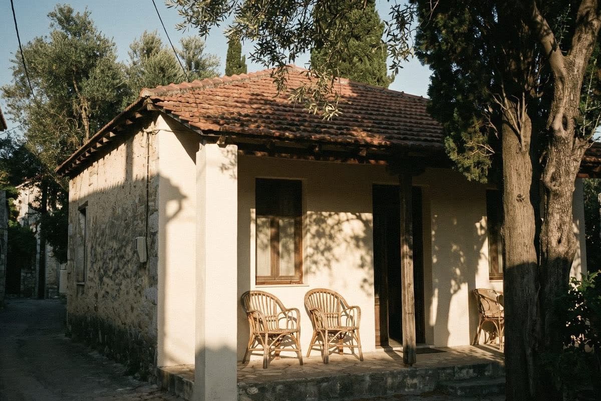
Cream with white trim: a two-tone that looks clean and expensive
These two colours differ the least, but the effect is better than you'd expect. White on the window trim, mouldings, fascia and columns makes the cream look intentional and cleaner, like a cream shirt with a white collar. The house looks refined without using a dark colour at all.
The thing to watch is that the white on the trim should be a soft white or a neutral white. Use a strongly blue-tinged white and the cream beside it instantly looks yellower, because the two colours pull in opposite directions.
- 1. Walls Ivory, trim Snowflake, door Chocolate
- 2. Walls Popcorn, trim Blizzard, teak door
- 3. Walls Oatmeal, trim Powder Snow, door Navy
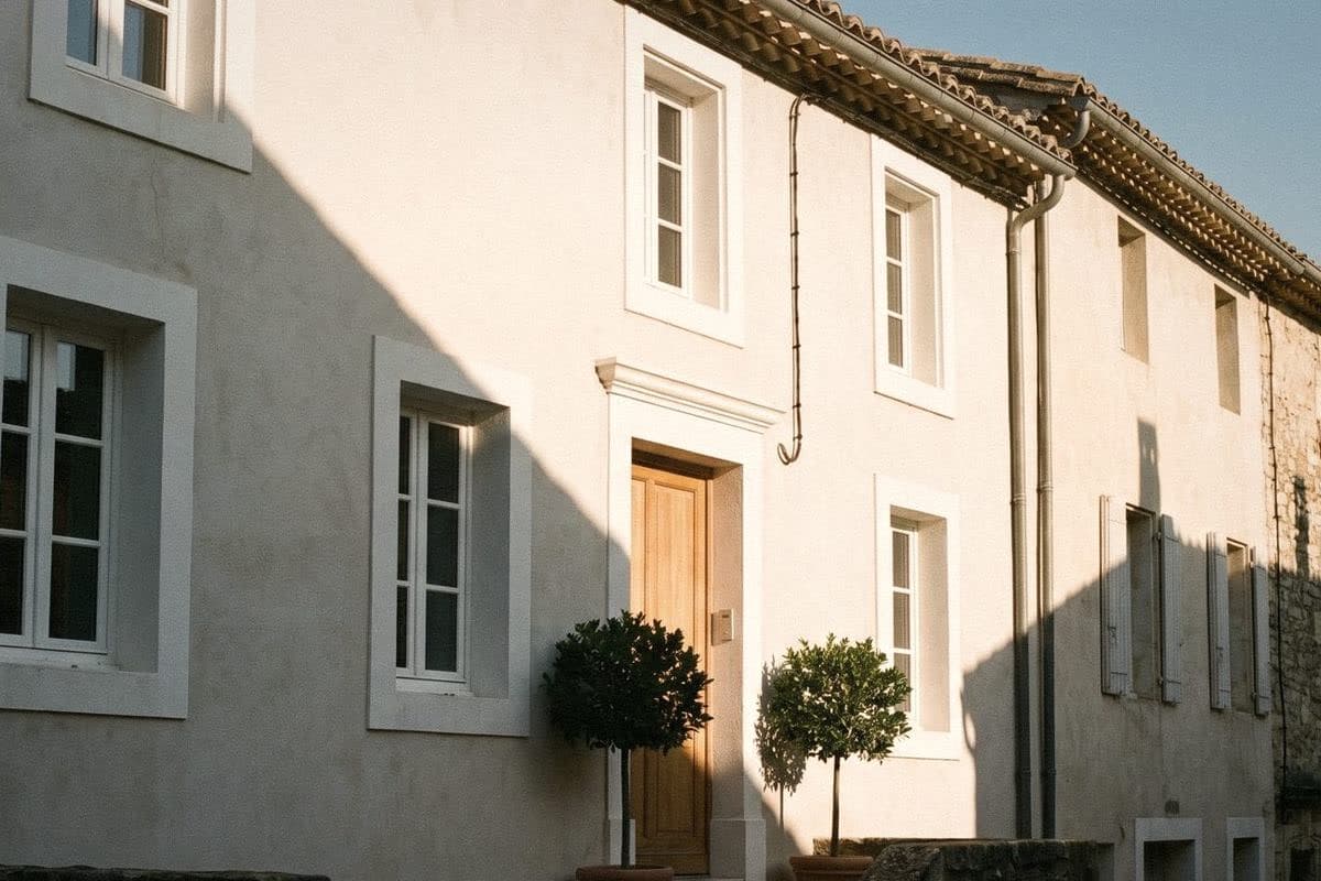
Two-tone cream and grey exterior paint: warm, but modern
Cream with grey is a pairing many people overlook, but it suits a modern house that doesn't want to look cold. The grey makes the cream look calmer and more grown-up, and the cream makes the grey look warmer. Use a mid to dark grey for a box, a band or the lower part of the wall, with cream for the main walls.
A grey with a slightly warm undertone blends with cream more smoothly than a bluish grey. If the roof is already dark grey or black, this pairing makes the whole house look like a set.
- 4. Walls Ivory, band Soft Gray, trim Ivory, door Shadow Stone
- 5. Walls Popcorn, lower wall Tornado Gray, trim Snowflake, door Shadow Stone
- 6. Walls Oatmeal, upper box Shadow Stone, trim Snowflake, wooden door
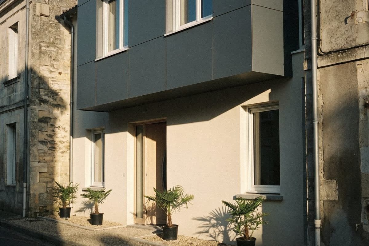
Cream and brown: the classic pairing that never dates
Cream with dark brown is a pairing seen on Thai houses for generations. It goes with wooden frames, wooden doors and earth-toned tile roofs. Use brown on the window trim and doors, and the house looks warm, like a home that's been lived in for years and still looks good.
To make this pairing look more contemporary, use a dark brown that's almost black instead of a reddish brown, and choose a slightly muted cream. The house instantly looks simpler. If you want the full classic look, add a mid-brown band along the lower wall, which also helps hide mud splashes.
- 7. Walls Popcorn, trim Coffee Bean, door Coffee Bean
- 8. Walls Ivory, band Coconut Sugar, trim Chocolate, teak door
- 9. Walls Oatmeal, lower band Caramel, trim Red Wine, door Red Wine
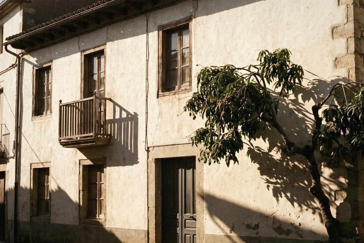
Cream and green: a house that connects with the garden
Cream with dark green is a pairing well worth trying. A pine green or muted green on the door, louvred shutters or balcony railing connects the house with the garden. The cream makes the green look fresh, and the green makes the cream look tasteful, like khanom chan, the layered Thai dessert, where pandan green and coconut cream look more appetising together than on separate plates.
Keep the green to fairly small areas, such as the door, shutters or fence. If you want to use green for a band, choose a slightly muted grey-green. It looks more grown-up than a bright green, which can make the house look like an ice-cream shop.
- 10. Walls Ivory, trim Snowflake, door and shutters Coastal Pine
- 11. Walls Popcorn, band Pine Green, trim Blizzard, door Horse Poop
- 12. Walls Whipped Green Tea, trim Snowflake, door Green Tea Latte
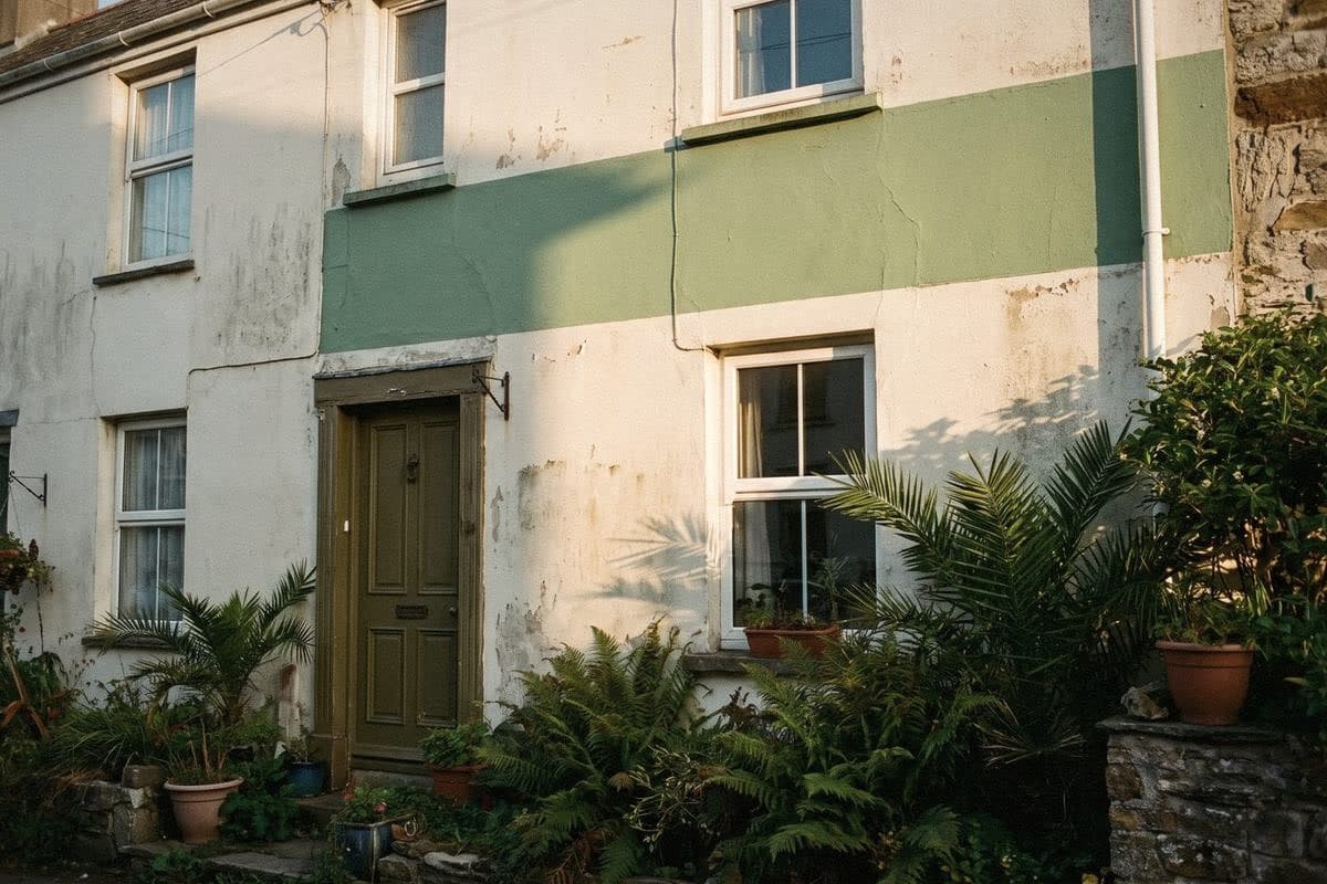
How to paint a house cream without it looking yellow, or showing rain streaks
The number one problem with cream houses is that once painted, the house looks yellower than the colour you chose. That's because colour on a large wall looks darker and brighter than a small chip, and the golden evening sun draws out another layer of yellow. The fix is to choose a cream one step lighter than the one you like, and to choose a cream with a hint of grey or beige rather than a clear yellow cream.
The second problem is marks. Every light-coloured house shows rain streaks under window ledges, under awnings and on the lower wall where mud splashes up. You can tackle part of this at the source, for example with mouldings or drip edges, and by making the lower wall darker. A glossier paint finish is also easier to wipe clean. Voqe Wall Paint works inside and out, and comes in both Eggshell and Semi gloss.
- Choose a cream one step lighter than the one you like.
- Compare the cream against white paper. If it's clearly very yellow, try a more muted one.
- Paint a large sample patch on the actual wall, and look at it at noon and in the evening sun.
- Make the lower wall, up to about knee height, darker to hide splashed mud.
- Look after the mouldings, window ledges and gutters so water doesn't run down the wall in streaks.
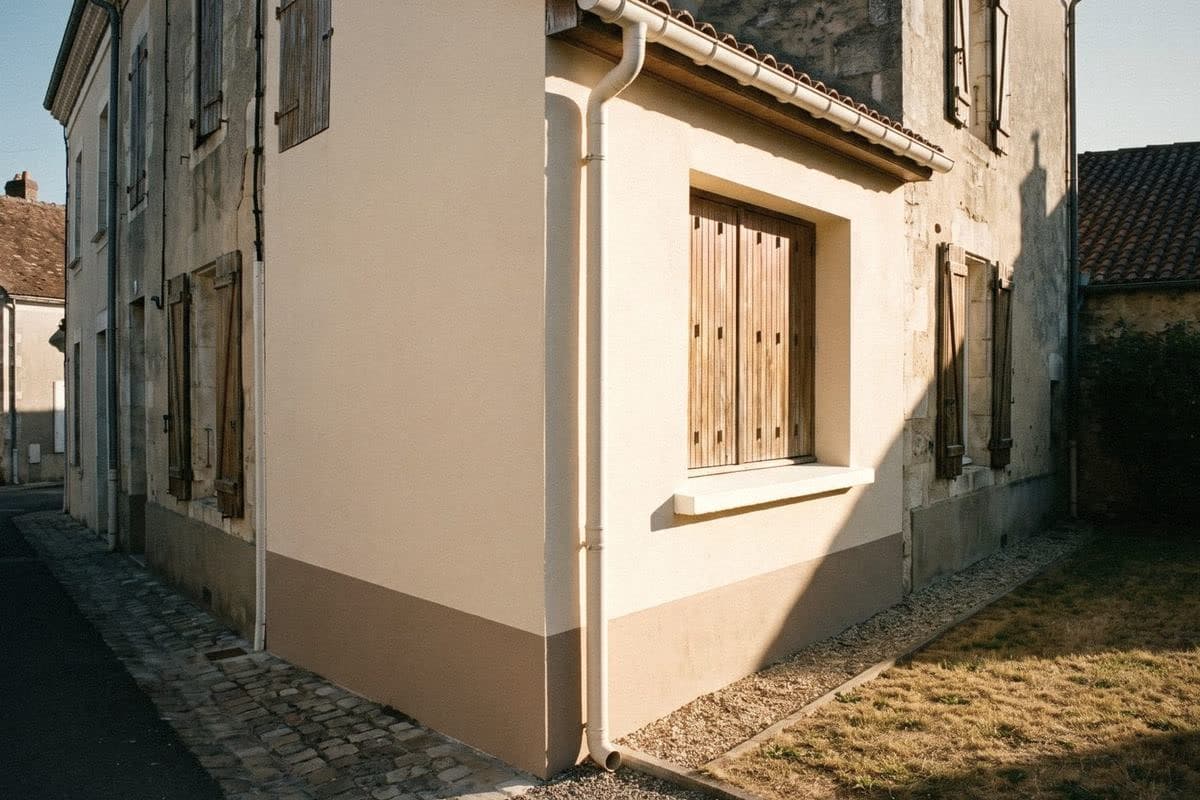
“A good cream doesn't shout that it's cream. It just quietly makes the house feel warmer.”
Frequently asked questions
Is cream a good colour for an exterior?
Yes. Cream is a light colour that's bright and reflects heat better than dark colours, has less glare than pure white in the sun, and hides light dust better. Choose a slightly light, muted cream so the house doesn't look yellow.
What colour goes with a cream house?
Cream with white looks clean, cream with grey looks modern, cream with dark brown looks warm and classic, and cream with dark green ties in with the garden. Use cream for the main walls and the darker colour for the trim, bands or door.
My cream house looks yellow. How do I fix it?
Try changing the trim or band colour to a warm grey or muted brown, and avoid a bluish white on the trim; the cream will look less yellow. If you're still not happy, repaint in a lighter, more muted cream, and paint a large sample patch to check in real sunlight first.
Does a cream house get dirty easily?
More easily than mid tones, but less than pure white. Marks show most under window ledges, under awnings and on the lower wall. Making the lower part darker and looking after drip edges helps a lot.
What's the difference between cream and white on an exterior?
The difference is clear in the sun. White is brighter, glarier and shows marks sooner. Cream is softer on the eye and looks warmer, which is why many houses use cream for the main walls and white for the trim.

Colour on a screen never matches colour on a wall
Order a sample to paint at home, or come and see the full shade library at Voqe Studio, Bang Phli.
Order cream sample jars to try on a real wallRead next
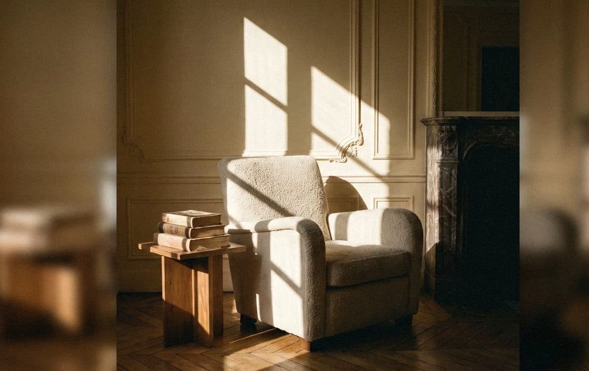
Cream: a slightly kinder white for a home that feels soft all day
Cream is white with a kinder heart: warmer than white, brighter than beige. Voqe's cream shades, and how to choose one without turning your room yellow.
Read article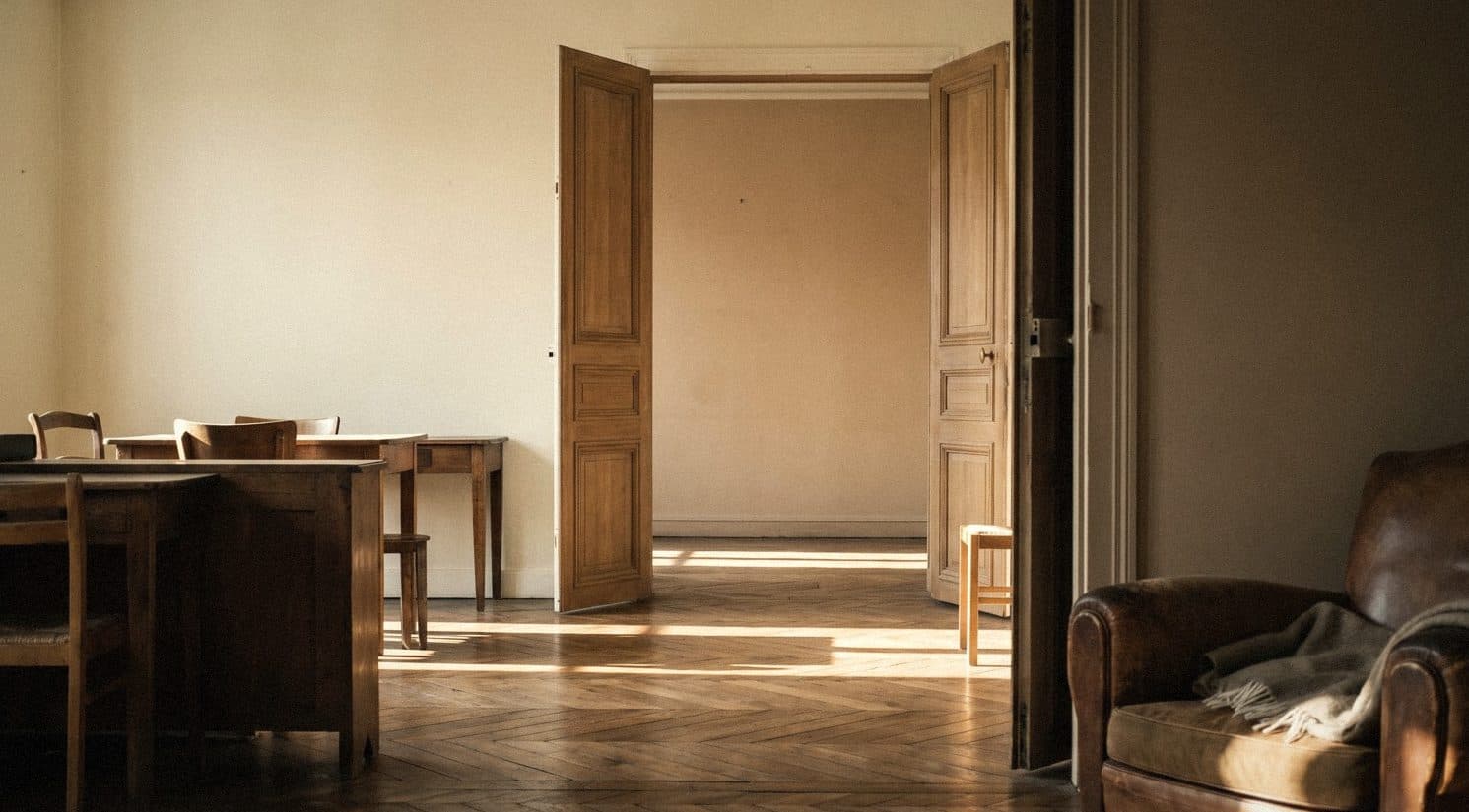
Cream vs beige: what's the difference, and which should your room use?
Cream is warm milk in the morning; beige is a latte in the afternoon. They look alike, but they give a room very different moods.
Read article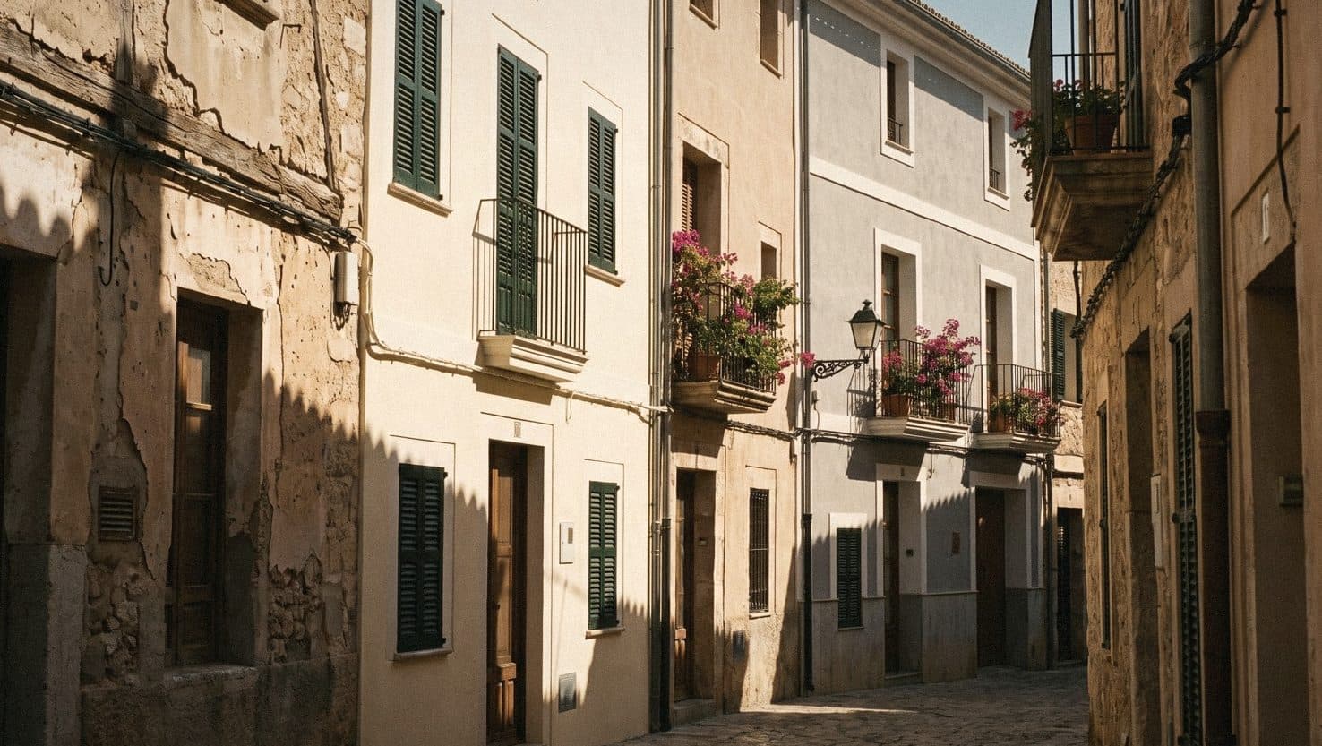
Exterior house paint: pairing colours that look good and stand up to Thai sun and rain
Your house is the biggest shirt you wear every day. Thai sun is strong and Thai rain is heavy, so choose a colour that looks good and one that lasts.
Read article