


Feature walls, painting one wall, or two-tone walls: ideas that make a room look intentional
One feature wall turns an ordinary room into one that looks intentional. Just choose the right wall, then be a little braver.
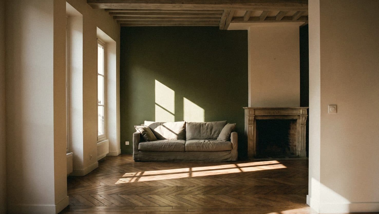


A feature wall is one wall in a room that is painted or finished differently from the others to create a focal point. The best wall is usually the one you see first when you walk into the room, such as the wall behind the bed or behind the sofa, and it should have few doors and windows. Popular techniques include painting a single wall, two-tone walls split in half, colour blocks, painted arches and textured walls.
What is a feature wall, and which wall should you choose?
A feature wall works like a beautiful pair of earrings for a room. The outfit is simple, but one piece catches the eye, so the room looks intentional rather than just painted and done.
The right wall is usually the one you see first when you open the door, or a wall that already has a job: the wall behind the bed in a bedroom, the wall behind the sofa or TV in a living room, the wall by the dining table. A wall with several doors and windows usually doesn't work, because the colour gets chopped into pieces until there's nothing left to stand out.
A wall that already has a standout feature, such as a fireplace or built-in bookshelves, also works well. The colour helps that feature stand out more clearly.
- Bedroom: the wall behind the bed
- Living room: the wall behind the sofa or TV
- Dining room: the wall the table sits against
- Entrance: the wall you see as soon as you open the door
- Avoid: walls with several doors and windows
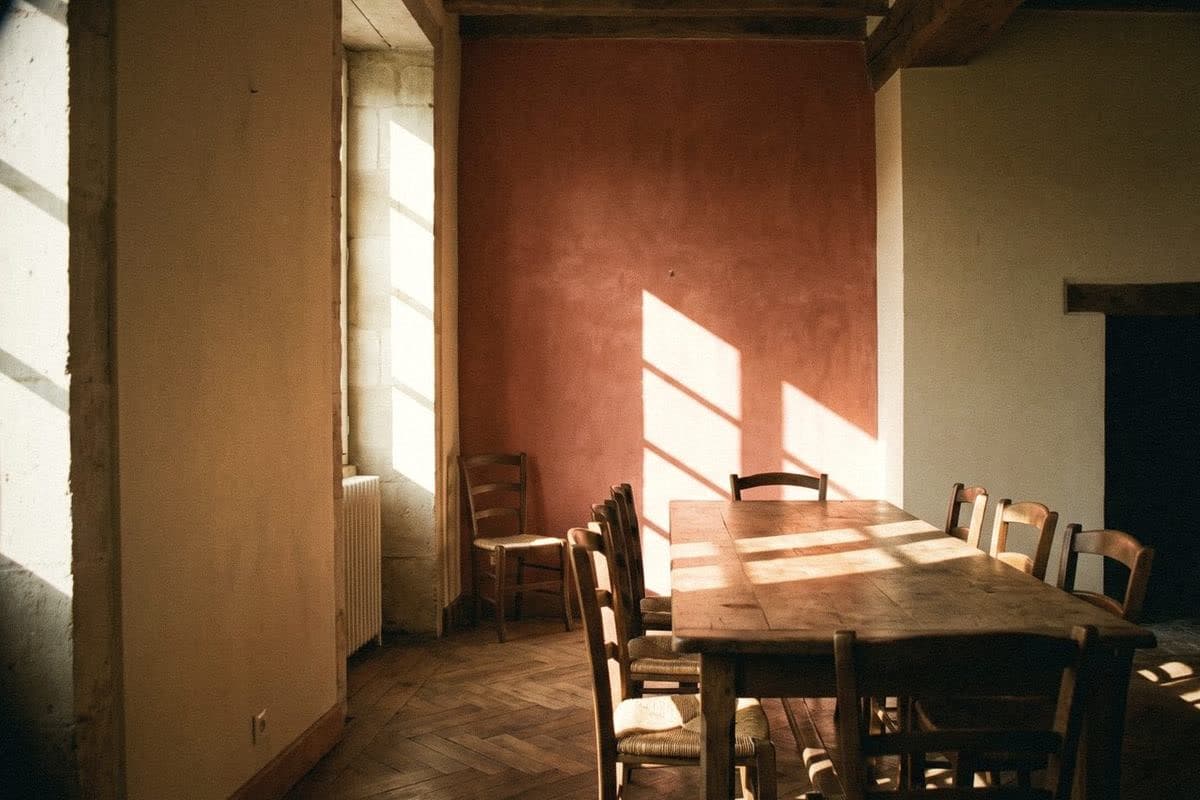
Painting one wall: how to choose a colour that suits the whole room
The safest way is to take the feature wall colour from something already in the room: cushions, a rug, curtains or a picture you love. The colour will look at home straight away, because it's already related to things in the room.
Another way is to use the same colour as the other walls but several shades deeper. Cream walls with a caramel feature wall, soft white walls with a grey-green feature wall. The room looks harmonious but has depth. A strong contrast, such as a navy wall in a white room, gives a crisp, modern look and suits a room that gets enough light.
Remember that a dark colour on one wall makes that wall look closer. In a long, narrow room, painting a short wall dark helps the room look better proportioned.
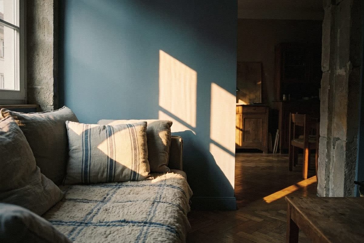
Two-tone walls, split top and bottom
A two-tone wall split horizontally is an old technique that's back in fashion. The darker colour goes below and the lighter one above, which makes a room feel grounded, like a white shirt with dark trousers. The lower half also hides handprints, chair scuffs and children's marks well.
The height of the dividing line changes the mood of the room. A low line, around chair-back height, feels classic. A high line, around two-thirds of the way up the wall, feels enveloping. Try sticking masking tape on the wall at different heights and stepping back to look before you decide.
A crisp line is the heart of this job. Use a laser level or a spirit level to mark the line, press the tape down firmly, paint the lighter colour first and then the darker one. Peel the tape off while the paint is still slightly wet and the line will be sharper than if you wait until it's completely dry.
- Low line: classic, good for dining rooms and hallways
- Middle line: balanced, works in almost any room
- High line: enveloping, good for bedrooms
- Use a laser level, and peel the tape while the paint is still slightly wet

Colour blocks and painted arches
Colour blocking means painting geometric shapes on a wall: a rectangle behind a desk, a stripe running across the wall and onto the ceiling, or a block of colour that marks out a zone in a small room, such as a reading corner in a living room. It makes one room feel like several spaces without building any dividing walls.
A painted arch means drawing a shape with a curved top on the wall, then painting the inside a different colour from the wall. It's a way to soften a room that's all straight lines, and suits the wall behind a bed, behind a dressing table or a corner for plants. Tie a pencil to a piece of string and use it as a compass to draw a neat curve.
- A colour block behind a desk: marks out a work zone
- A stripe running from the wall onto the ceiling: draws the eye upwards
- An arch behind the bed: can stand in for a headboard
- An arch in a plant corner: creates a photo spot at home

Textured walls, and the ceiling as the fifth wall
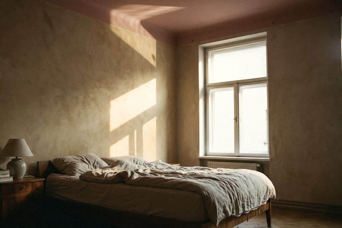
A feature wall doesn't always have to stand out through colour. It can stand out through surface. A limewash plaster-effect wall in the same tone as the other walls gives a room depth without a contrasting colour. When window light falls across it at an angle, the surface plays beautifully with light and shadow. If you'd like a wall like this, Voqe Mineral Finish is a limewash-style mineral paint that creates this kind of feature wall with a single brush.
Another wall people often forget is the ceiling, the fifth wall. A pale ceiling tinted with the same colour as the walls makes a room feel warmer. A dark ceiling in a room with high ceilings makes the room feel more enveloping and intimate. But in a room with a low ceiling, a pale ceiling is still the safer choice.
- A textured wall in the same tone as the room: depth without being loud
- A ceiling tinted with the wall colour: feels warmer
- A dark ceiling: suits rooms with high ceilings
Mistakes that make a feature wall look unintentional
A feature wall that looks odd usually isn't the wrong colour. It's in the wrong place, or there are too many of them. A good feature wall is one wall per room, and there should be a reason for it, such as being the wall behind the bed or the wall you see first.
Before you paint the whole wall, paint a large sample on the actual wall and look at it in the morning, in the afternoon and with the lights on at night. A colour that looks beautiful in the shop may look different in a room that gets light from a different direction.
- Several feature walls in one room
- Choosing a wall with several doors and windows
- A feature wall colour that has nothing to do with anything in the room
- A crooked colour line, because it wasn't levelled
- Not trying a sample on the actual wall first
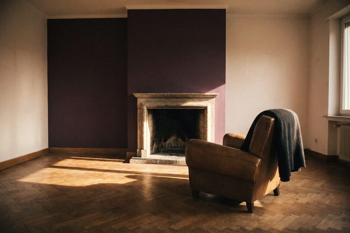
“One room, one feature wall. Like the best lipstick, you only need one colour.”
Frequently asked questions
Which wall should be the feature wall?
Usually the wall you see first when you walk into the room, such as the wall behind the bed or behind the sofa, and it should have few doors and windows.
What colour should I paint a single feature wall?
Take a colour from things in the room, such as cushions, a rug or a picture, or use the same colour as the other walls but several shades deeper. The room will look harmonious but have a focal point.
On a two-tone wall, should the darker colour go on top or at the bottom?
The darker colour usually goes at the bottom and the lighter one on top. The room feels grounded, and the lower half hides handprints and chair scuffs well.
Can I paint a dark feature wall in a small room?
Yes, but choose the right wall, such as the short wall of a long, narrow room. The dark colour makes that wall look closer, helping the room look better proportioned. The room should also get enough light.
How do I get a straight line on a two-tone wall?
Mark the line with a laser level or spirit level, press the tape down firmly, paint the lighter colour first and then the darker one, and peel the tape off while the paint is still slightly wet for a sharper line.

Colour on a screen never matches colour on a wall
Order a sample to paint at home, or come and see the full shade library at Voqe Studio, Bang Phli.
Take the quiz to find the right colourRead next
Limewash plaster-effect wall ideas room by room: bedroom, living room and entrance, through to cafés
You don't need limewash on every wall in the house. Choose the right wall and the whole room changes mood. Ideas room by room, with shades to match.
Read article
10 beautiful loft wall ideas, room by room, with shades that give a loft feel
Loft doesn't mean grey through the whole house. Here are 10 loft wall ideas that are easy on the eye to live with, from the living room to the front of the house.
Read article
Bedroom colours: how to choose for easy sleep and a good mood in the morning
The bedroom is the one room where you want colour to speak most quietly. Choose well and it feels as soft as a hotel bed with fresh sheets.
Read article