


7 principles of arranging and decorating a home that feels good to live in, as designers actually use them
A home that feels good to live in doesn't come from expensive things. It comes from seven simple principles that make everything in the house work together.
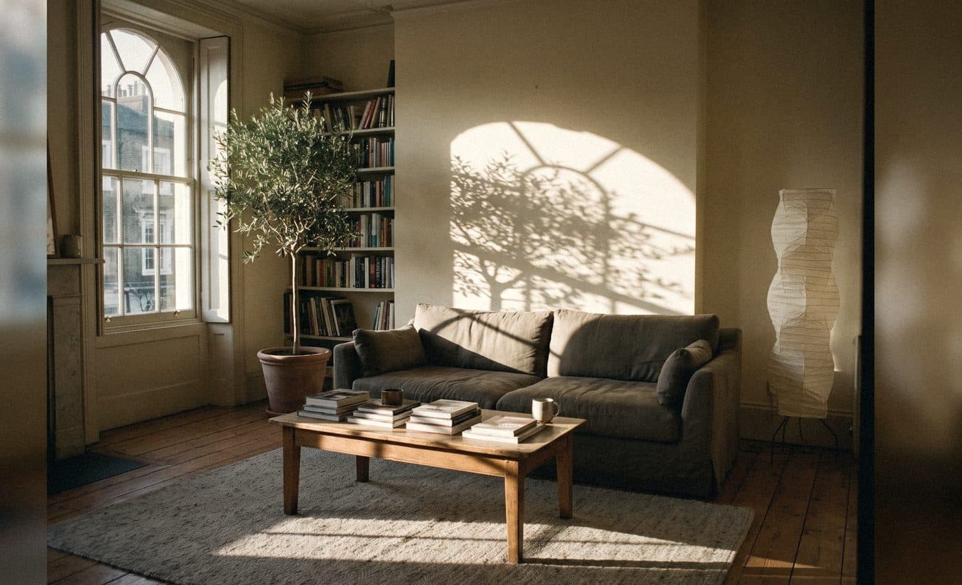

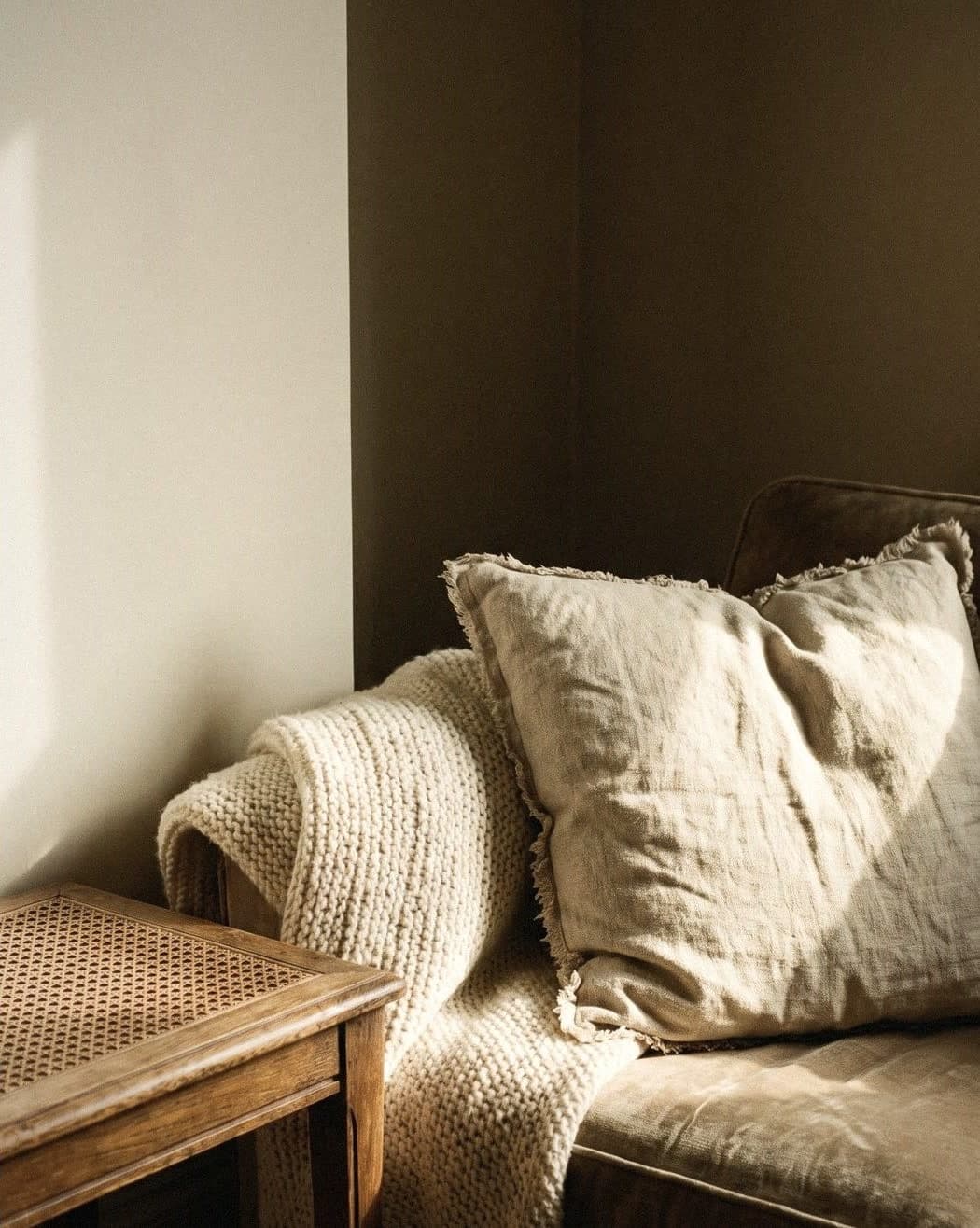
There are 7 principles for arranging and decorating a home that feels good to live in: 1) it works for real life, 2) walkways are clear and continuous, 3) balance, 4) proportions that suit the room, 5) colour that tells one story through the whole house, 6) several layers of light, and 7) texture and personal things that make the home yours. Always start with how you use a space before how it looks, then let colour, light and materials tell the same story.
What are the principles of a liveable home? The 7 in brief
Some homes have nothing expensive in them, yet you feel at ease the moment you walk in. Others have expensive things everywhere, yet living there is tiring. The difference isn't the budget. It's whether everything in the house works together or competes to be heard. Interior designers have used the same set of principles for a long time, and they're principles homeowners can use themselves.
Think of it like cooking a dish. Function is the flavour. Flow is how easy it is to eat. Balance and proportion are the plating. Colour and light are the atmosphere of the restaurant. Texture and personal things are the cook's own touch. Leave any one out and you can still eat it, but you won't want to come back for more.
- 1. Function: every room meets the real needs of the people who live there
- 2. Flow: you can walk from the door to the window without turning sideways
- 3. Balance: the visual weight of the room is spread out, not tipped to one side
- 4. Proportion: furniture is sized to fit the room and each other
- 5. Colour: one main colour story flows through the whole house
- 6. Light: daylight, task lighting and ambient lighting
- 7. Texture and personal things: real materials and the owner's own story

Function before looks, and walkways where you don't dodge table corners
Before you choose a colour or a sofa, write down what each room is really used for, not what it would be used for in an ideal world. If the dining table becomes a desk every day, that room needs a socket near the table, light that's bright enough and somewhere to keep papers close by. A liveable home starts with accepting the life you actually lead.
Flow is something you feel but rarely hear anyone talk about. If you have to turn sideways past the corner of a table every day, the room will feel cramped however beautiful it is. Main walkways in a home are usually about 80–90 cm wide, and should run continuously from the door to the places you use most, such as the window, the balcony or the kitchen.
- Write down what really happens in each room: who uses it, when, and for what
- Place sockets and lights to suit those activities, not the house's original layout
- Leave a main walkway of about 80–90 cm
- Things you use every day should be within one step's reach
- Things you use once a year go up high or at the back of a cupboard
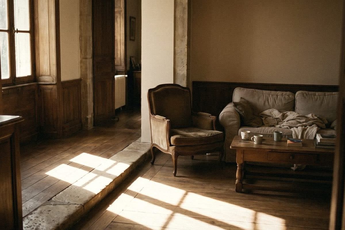
Balance and proportion: the principles that make a room look deliberate
Balance doesn't mean left and right have to match exactly. A room with a big sofa on one side might be balanced by a tall cabinet and a large plant on the other. What to watch out for is all the heavy pieces piled into one corner; the room will feel like a listing boat.
Proportion is about sizes that fit. A rug that's too small makes the sofa look adrift. A picture that's too small on a big wall looks like a postage stamp. And a coffee table that's too big makes the living room impossible to walk through. Try marking the real size of furniture on the floor with masking tape before you buy; it's the cheapest and most accurate method there is.
- Living room rug: the front legs of the sofa and chairs sit on it
- Art above the sofa: about two-thirds of the sofa's length
- Centre of a picture on the wall: around eye level, about 145–150 cm from the floor
- Curtains: hang the rail higher and wider than the window frame, and the window will look bigger
- Test sizes with masking tape on the floor before you buy

Colour and light: the two fastest ways to change the mood of a home
Homes that feel good to live in usually have one main colour story that flows through every room, such as soft white or pale beige, with each room adjusting it a little: softer in the bedroom, warmer in the living room. Walking from one room to the next feels continuous, not like changing TV channels.
Light in Thai homes is strong and changes fast. West-facing rooms get hot afternoon sun; north-facing rooms get soft, even light. So the same colour looks different in each room. Always test a colour on the real wall before you paint, and don't forget the night-time. Warm white lights make wall colours softer; cool white lights make a room look like an office.
For lighting, think in three layers: main light from the ceiling, task light for reading or cooking, and low ambient light from floor or table lamps. A room with all three layers will always be nicer to live in than a room with one big light.
- The same main colour throughout the house, lighter or deeper by room
- Test colours on the real wall, and look in the morning, afternoon and at night
- Living rooms and bedrooms: warm white bulbs
- Three layers of light: main, task, ambient

Texture and personal things keep a home from looking like a showroom
A room where everything is smooth, glossy and new looks clean but cold. A liveable home needs several textures in conversation: wood with visible grain, slightly creased linen, hand-thrown ceramics, rattan, and walls with a little depth. Textures like these catch the light differently, so the room stays alive all day.
The walls are the largest surface. If you want a wall with the depth of plaster without adding more things, Voqe Mineral Finish is a limewash-style mineral paint that can give one wall this kind of soft matt surface.
Last come the things with a story: books you actually read, family photos, things from your travels, or an old chair from your grandmother's house. These are what make a home yours. There's only one rule: choose just a few to display and rotate them. You don't need to put everything out at once.
- One piece of solid wood, or wood with visible grain, in every room
- Natural fabrics: linen, cotton, woven textiles
- One or two real plants per room
- Just a few carefully chosen personal things on display

A room-by-room checklist for a liveable home, and the most common mistakes
Don't try to sort out the whole house in one weekend. Start with the room you use most, finish it, then move on to the next. The feeling of having one room done will motivate you to keep going.
The most common mistakes usually come from starting in the wrong order: buying decorations before you know where they'll go, choosing colours from a picture on a screen without testing them on the real wall, or pushing every piece of furniture against the walls so the middle of the room is empty but unusable.
- Clear out what you don't use first
- Move furniture so the walkways are clear
- Repair and paint the walls before hanging anything on them
- Add lighting until you have all three layers
- Bring in natural textures and plants
- Finish with a few personal things
- Common mistakes: rugs too small, pictures hung too high, cool white light throughout the house

“A beautiful home photographs well. A liveable home is one you never want to leave.”
Frequently asked questions
What are the principles of decorating a home that feels good to live in?
There are 7: it works for real life, clear walkways, balance, the right proportions, colour that flows through the house, several layers of light, and texture and personal things. Always start with function before looks.
Where do I start making my home more liveable?
Start by clearing out what you don't use, then arrange the furniture so the walkways are clear, paint or repair the walls, add lighting, and only then add decorations. Work one room at a time, starting with the room you use most.
What colours make a home feel good to live in?
Most people use a light, warm main colour such as soft white, cream or beige that flows through the whole house, then add deeper or natural colours such as grey-green and brown on some walls or in decorations.
What are some ideas for decorating a home on a small budget?
Repaint the walls, change the bulbs to warm white, move furniture so the walkways are clear, hang curtains higher and longer, add real plants, and combine several small pictures into one large one.
How high should I hang pictures?
Usually the centre of the picture sits around eye level, about 145–150 cm from the floor. If you're hanging it above a sofa, leave a reasonable gap between the bottom edge of the picture and the back of the sofa, without letting it float too high.

Colour on a screen never matches colour on a wall
Order a sample to paint at home, or come and see the full shade library at Voqe Studio, Bang Phli.
Take the quiz to find your home's base colourRead next
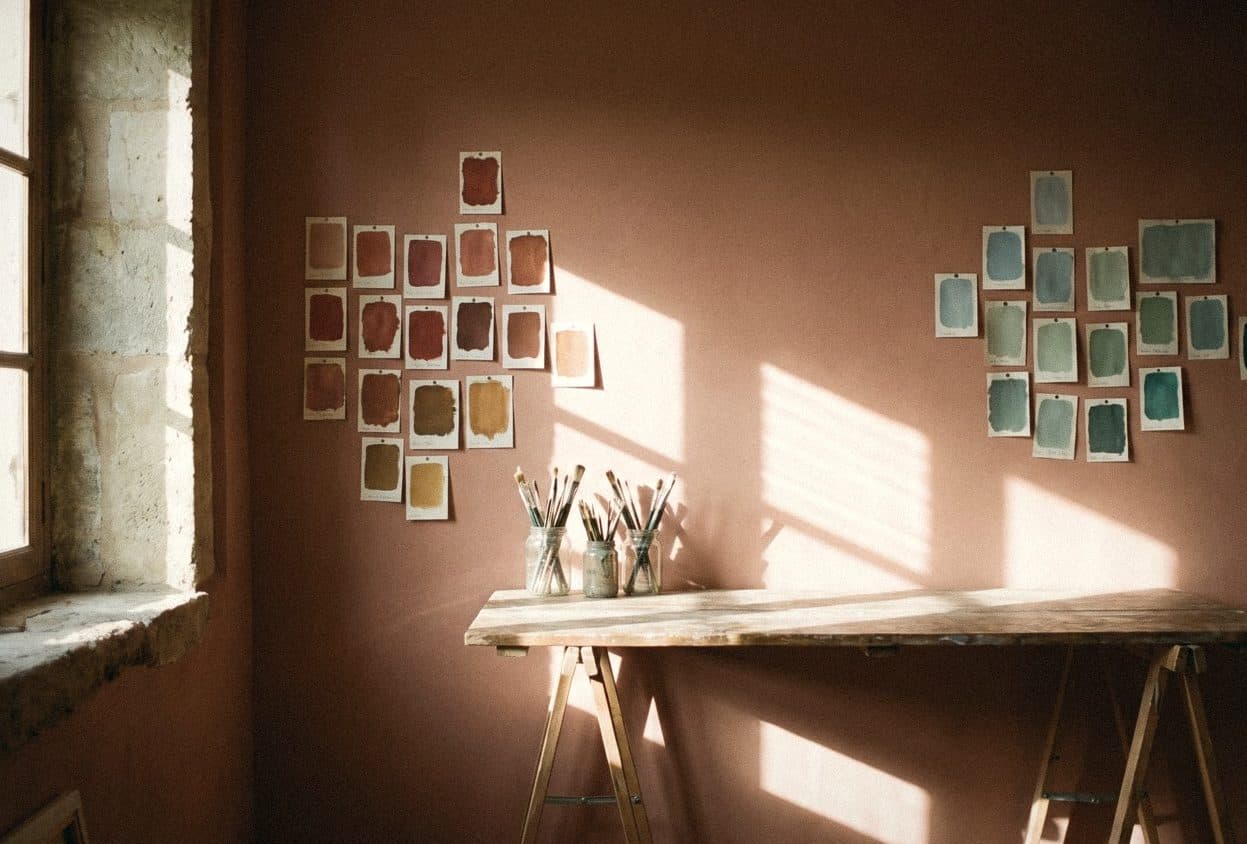
How to pair colours at home: the colour wheel, warm and cool tones, and the 60-30-10 rule
You don't need art school to put together beautiful colours at home. Just understand the colour wheel, warm and cool tones, the 60-30-10 rule, and the light in your own room.
Read article
What home decor styles are there? 12 popular styles, all on one page
Minimal, Nordic, Muji, loft: they sound alike but they are not the same. Here are 12 interior styles on one page, with the materials and wall colours that suit each.
Read article
Bedroom decorating: 15 realistic ideas for a beautiful room that's easy to sleep in
A beautiful bedroom doesn't come from expensive things. It comes from a bed in the right place, soft light, good fabrics and one wall done with intent. 15 ideas that work in a house or a condo.
Read article